St Ives
St Ives
St Ives
Brief: Previously located in downtown Manhattan, Unilevers' internal agency, Pitch, was an exploratory platform for conceptal ideas through collaboration, rapid fire design, and one of a kind performances.
The last few years have seen a steady surge of independent brands making their way to the top of the skincare industry. As a result large corporate brands are changing in order to appeal to a younger generation, reclaim market share dominance, and secure future relevance.
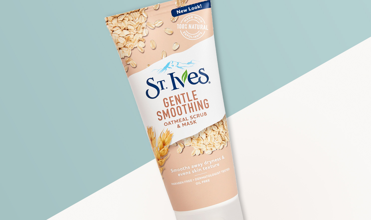
The project ask was to make the front of pack look more relevant for younger consumers without alienating the older and more loyal demographic. In the case of St. Ives that meant introducing new products and packaging but making sure to protect its legacy items.
Role:
Freelance Associate Creative Director
Responsibilities:
Brand Identity, Packaging Design, Client Management
Agency:
Unilever "Pitch" & 1HQ
Brief: Previously located in downtown Manhattan, Unilevers' internal agency, Pitch, was an exploratory platform for conceptal ideas through collaboration, rapid fire design, and one of a kind performances.
The last few years have seen a steady surge of independent brands making their way to the top of the skincare industry. As a result large corporate brands are changing in order to appeal to a younger generation, reclaim market share dominance, and secure future relevance.
The project ask was to make the front of pack look more relevant for younger consumers without alienating the older and more loyal demographic. In the case of St. Ives that meant introducing new products and packaging but making sure to protect its legacy items.
Role:
Freelance Associate Creative Director
Responsibilities:
Brand Identity, Packaging Design, Client
Management
Agency:
Unilever "Pitch" & 1HQ
Brief: Previously located in downtown Manhattan, Unilevers' internal agency, Pitch, was an exploratory platform for conceptal ideas through collaboration, rapid fire design, and one of a kind performances.
The last few years have seen a steady surge of independent brands making their way to the top of the skincare industry. As a result large corporate brands are changing in order to appeal to a younger generation, reclaim market share dominance, and secure future relevance.
The project ask was to make the front of pack look more relevant for younger consumers without alienating the older and more loyal demographic. In the case of St. Ives that meant introducing new products and packaging but making sure to protect its legacy items.
Role:
Freelance Associate Creative Director
Responsibilities:
Brand Identity, Packaging Design, Client Management
Agency:
Unilever "Pitch" & 1HQ
Brief: Previously located in downtown Manhattan, Unilevers' internal agency, Pitch, was an exploratory platform for conceptal ideas through collaboration, rapid fire design, and one of a kind performances.
The last few years have seen a steady surge of independent brands making their way to the top of the skincare industry. As a result large corporate brands are changing in order to appeal to a younger generation, reclaim market share dominance, and secure future relevance.
The project ask was to make the front of pack look more relevant for younger consumers without alienating the older and more loyal demographic. In the case of St. Ives that meant introducing new products and packaging but making sure to protect its legacy items.
Role:
Freelance Associate Creative Director
Responsibilities:
Brand Identity, Packaging Design, Client Management
Agency:
Unilever "Pitch" & 1HQ
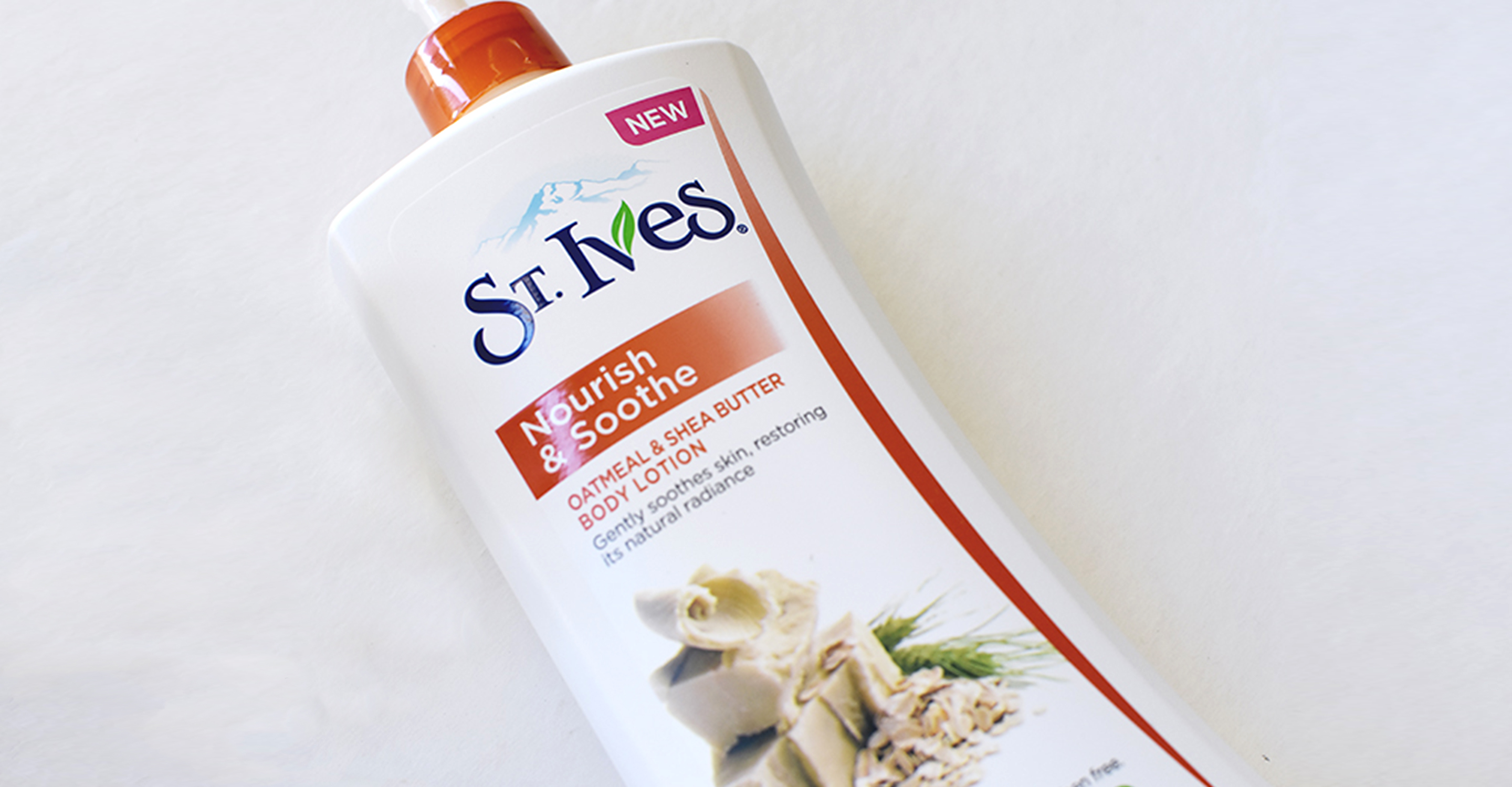
Image Above: Original packaging for the St Ives Oatmeal & Shea Butter.
The prominence of ingredients, on front of pack, coupled with a clean aesthetic was the key element that advertises the natural quality of the product and the St. Ives brand proposition.
However, in order to engage a wider audience the new design needed to shift away from clinical conventions to engaging the consumer through a modern and vibrant visual system.

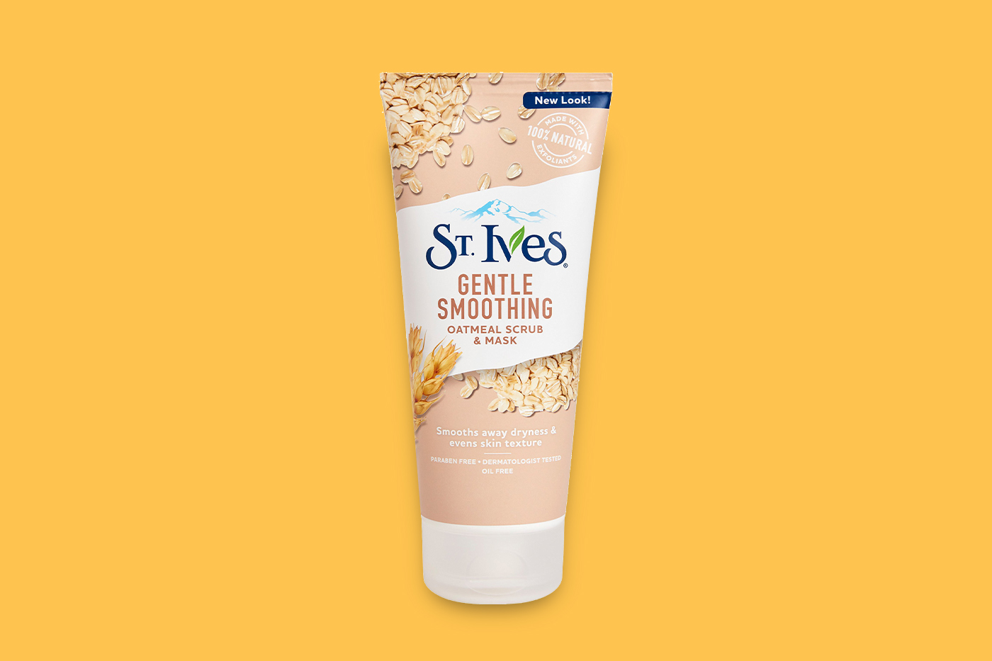
There were three product SKU's represented by three distinct colours and images: Facial Scrub, Body Wash and Body Lotion.
There were three product SKU's represented by three distinct colours and images: Facial Scrub, Body Wash and Body Lotion.
There were three product SKU's represented by three distinct colours and images: Facial Scrub, Body Wash and Body Lotion.
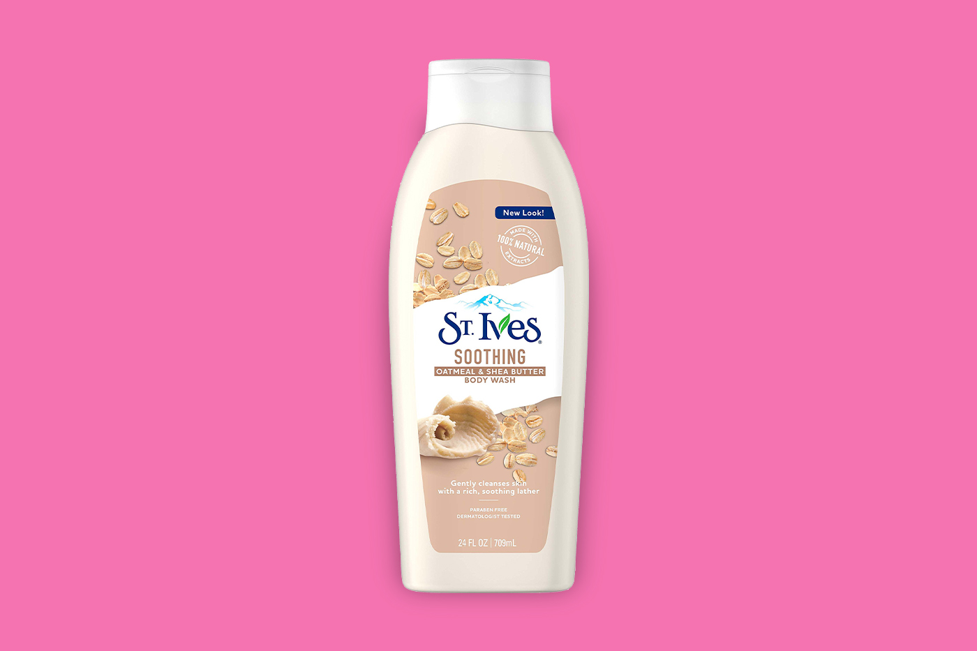

The updated packaging uses a simple architecture that can easily be implemented across all product SKU's, while the new design aligns with the St. Ives Brand Purpose, "A daily boost of nature is the key to a vibrant life."
The updated packaging uses a simple architecture that can easily be implemented across all product SKU's, while the new design aligns with the St. Ives Brand Purpose, "A daily boost of nature is the key to a vibrant life."

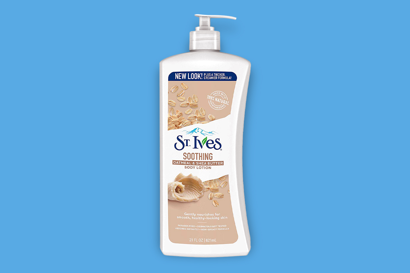
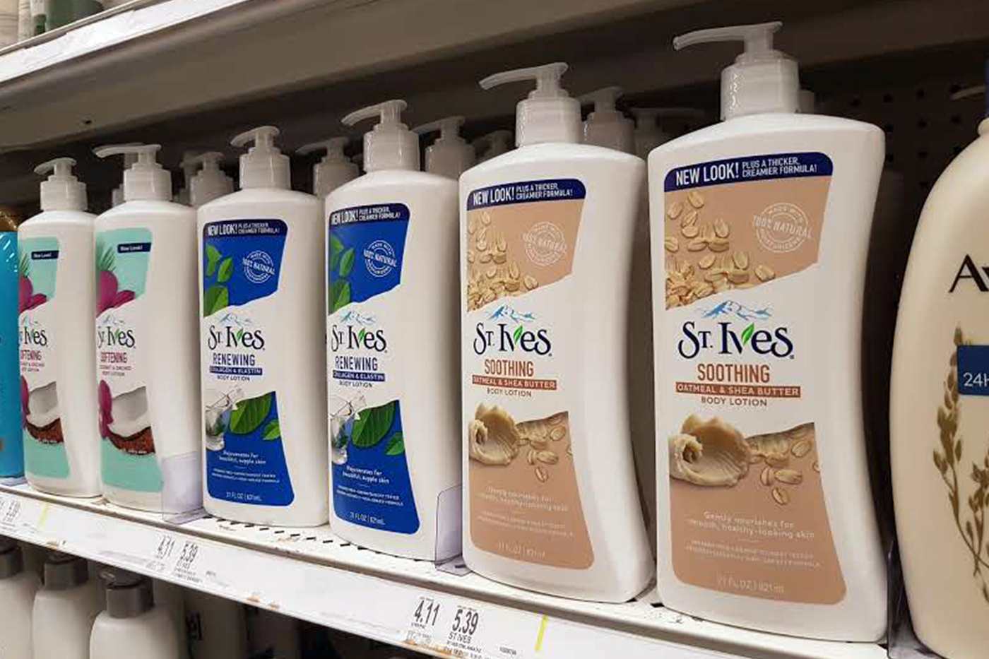
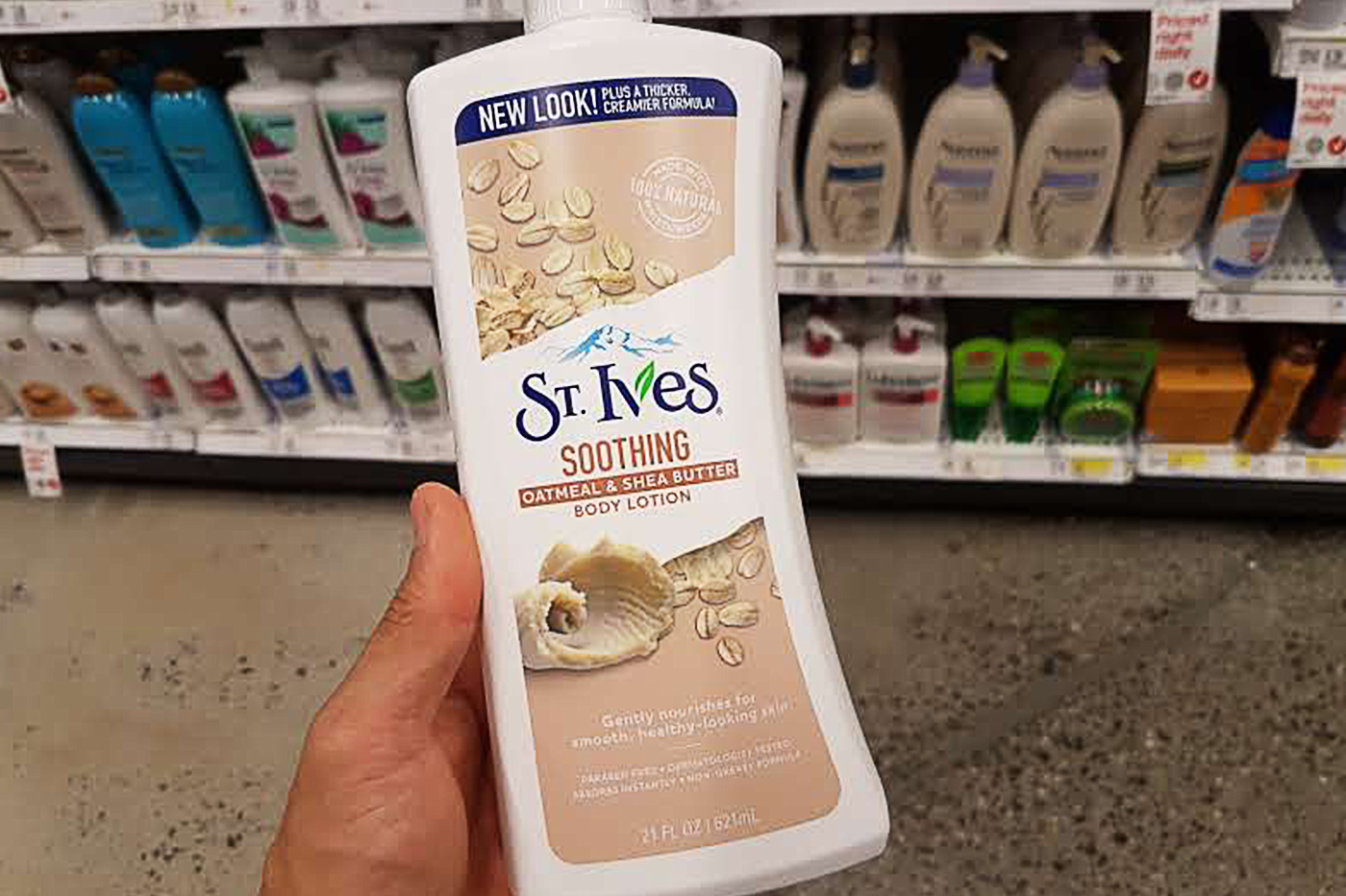
New Product • In Store
New Product
In Store
Moon Powered

