Chase
Chase
Chase
Brief: Metal credit cards, though in circulation for a number of years, were selectively marketed towards the extremely weathly. As the affordable luxury market grew, card companies started targeting a greater spectrum of consumers by creating an accessible range of metal credit cards.
In 2011, Chase patented its metal design and started to roll out its Sapphire Preferred card in embedded metal. It proved so popular that the company temporarily ran out of the metal version of the card.
We started with the strategy and how this particular card would roll out with regards to the others that were being created in tandum. Then we went through naming, brand architecture, identity design, material experimentation and a cohesive visual system from concept to production.
Role:
Senior Designer
Responsibilities:
Concept Development, Art Direction, Brand Identity, Typographic
Design, Material Development, Client Management
Agency:
McGarry Bowen
Brief: Metal credit cards, though in circulation for a number of years, were selectively marketed towards the extremely weathly. As the affordable luxury market grew, card companies started targeting a greater spectrum of consumers by creating an accessible range of metal credit cards.
In 2011, Chase patented its metal design and started to roll out its Sapphire Preferred card in embedded metal. It proved so popular that the company temporarily ran out of the metal version of the card.
We started with the strategy and how this particular card would roll out with regards to the others that were being created in tandum. Then we went through naming, brand architecture, identity design, material experimentation and a cohesive visual system from concept to production.
Role:
Senior Designer
Responsibilities:
Concept Development, Art Direction, Brand Identity, Typographic Design, Material Development, Client Management
Agency:
McGarry Bowen

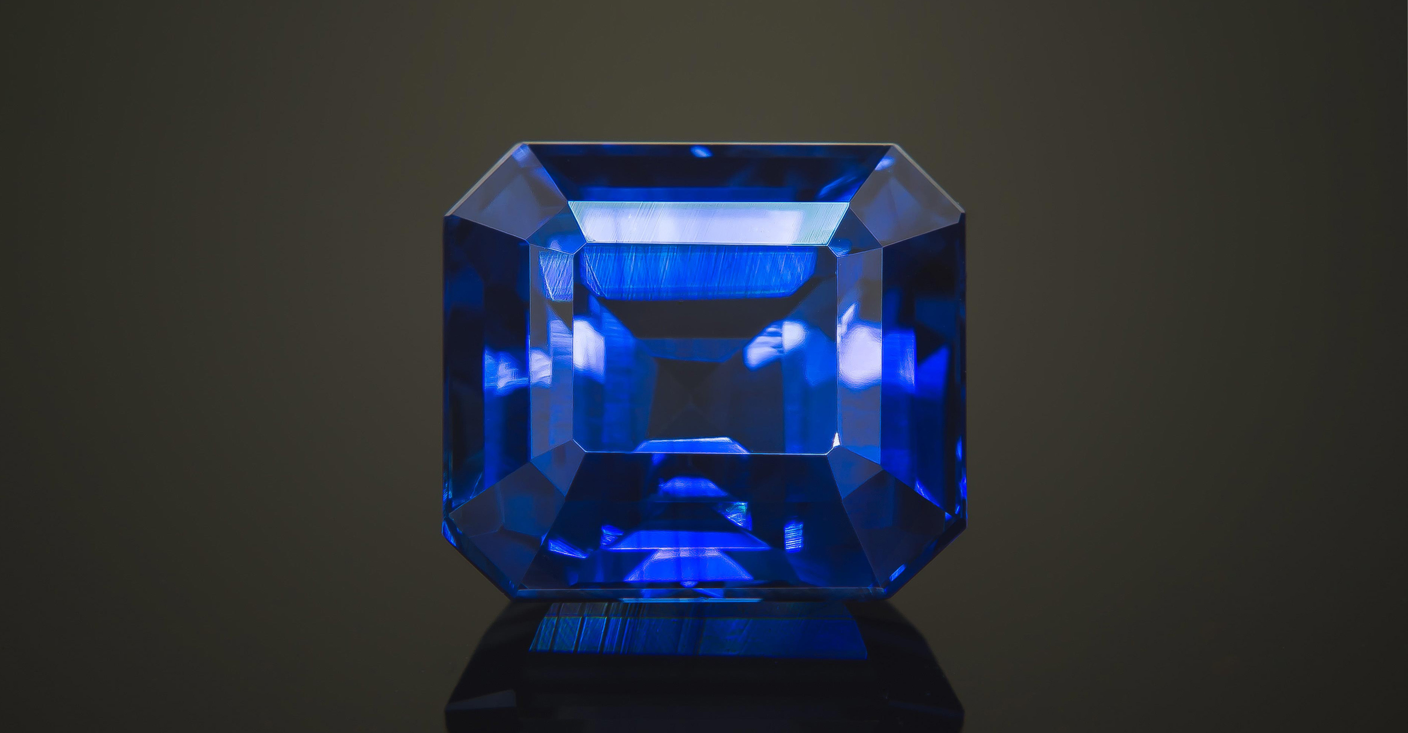
Image Above: Inspiration for the Chase Sapphire Credit Card (Perfect Cut Sapphire). Metal credit cards offer an allure not found with traditional plastic cards. There is a sensual luxury due to the heft, weight and streamline minimalism.

In order to translate the experience of luxury to this card we challenged the "traditional" standards of credit card design. We started by removing all type from the front of the card and let the logo lock up stand alone keeping the face of the card clean.
Then, as shown below, we changed the traditional Visa brand colours to silver to maintain consistency with the remaining typographic elements; numbers, exp date, and so forth.


Moon Powered


