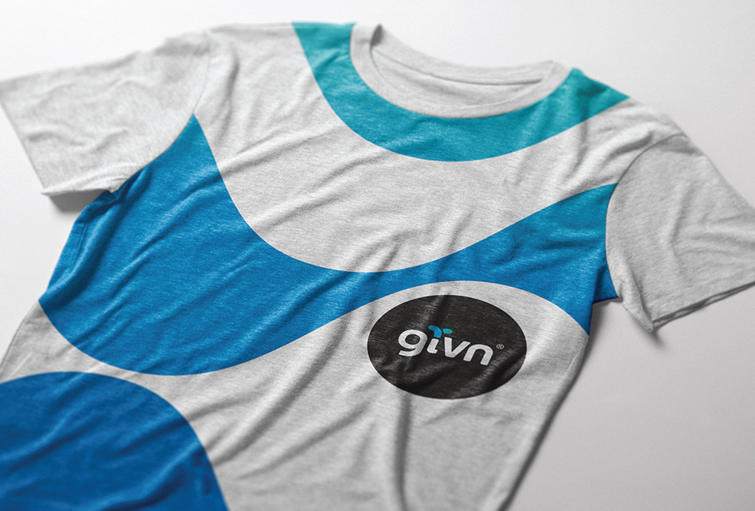
givn™ water
Evology
givn™ water
Project: Everything starts with water. That's a givn.
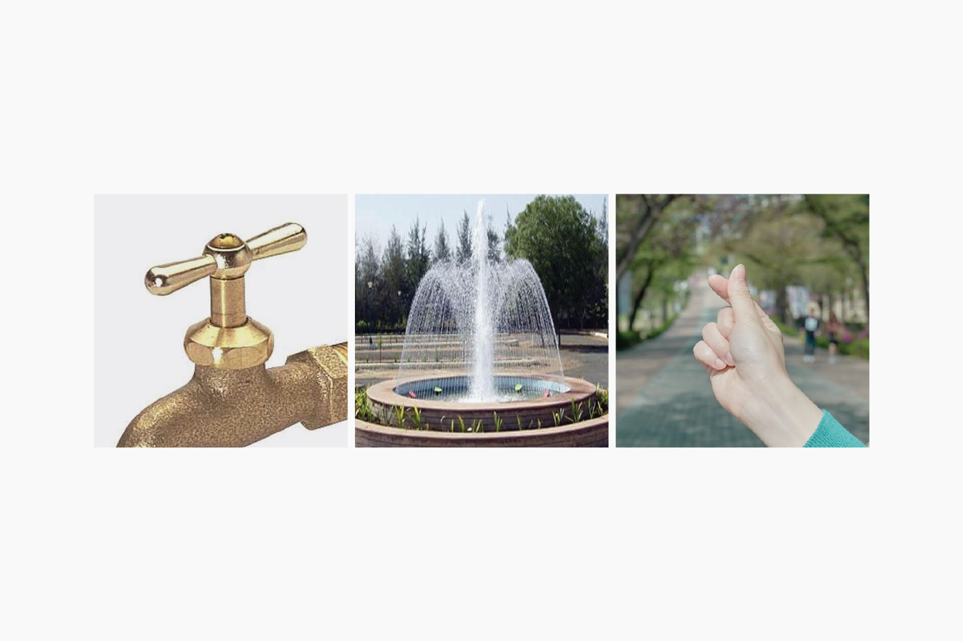
givn™ water is a premium, pure mineral water, high in electrolytes, naturally alkaline (7.8pH) and absolutely delicious. Every GIVN bottle gives you the opportunity to drink and give. By purchasing givn™ water you provide access to one day of clean water to a person in need. You buy to give. It's simple.
Beyond the product, the givn™ water brand is about building a tribe of conscious consumers and committed retailers. Collectively, their vision is driven by equality through water and ubiquitous access to a basic human resource.
I was initially brought on as a consultant, which evolved into a combination role of creative execution, art direction and strategy. I worked with givn™ as a probono contractor and helped them to streamline their current offering and launch a secondary product from end-to-end.
Role:
Creative Director
Responsibilities:
Advertising, Art Direction, Brand Identity, Consultant, Content Development, CPG, Naming, Product Development, Production, Strategy, Web
Client:
givn™ water
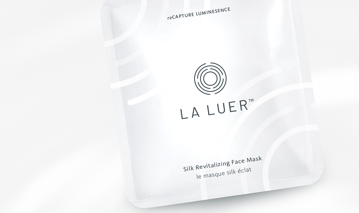
Brief: Los Angeles base company LA LUER is a skincare brand focused on an at-home tool and products that are convenient and easy to use. CEO and Owner, Nicole Chan developed "MIRA," a smart device that guides you through a simple beauty routine that is effective and efficient in helping you get results for healthy, radiant skin.
We started by defining the scope of her market; location, demographics, SWOT analysis... and more. Since her primary sales channel was B2B wholesale it influenced the immediate identity and collateral needs of the brand. From there we leveraged the technical idea behind her products to create a brand story and visual identity founded on the premise "progression of refinement."
Role:
Freelance Designer
Responsibilities:
Brand Identity, Packaging Design, Client
Management
Client:
La Luer
Brief: Los Angeles base company LA LUER is a skincare brand focused on an at-home tool and products that are convenient and easy to use. CEO and Owner, Nicole Chan developed "MIRA," a smart device that guides you through a simple beauty routine that is effective and efficient in helping you get results for healthy, radiant skin.
We started by defining the scope of her market; location, demographics, SWOT analysis... and more. Since her primary sales channel was B2B wholesale it influenced the immediate identity and collateral needs of the brand. From there we leveraged the technical idea behind her products to create a brand story and visual identity founded on the premise "progression of refinement."
.
Role:
Freelance Designer
Responsibilities:
Brand Identity, Packaging Design, Client Management
Client:
La Luer
Project: Everything starts with water. That's a givn.
givn™ water is a premium, pure mineral water, high in electrolytes, naturally alkaline (7.8pH) and absolutely delicious. Every GIVN bottle gives you the opportunity to drink and give. By purchasing givn™ water you provide access to one day of clean water to a person in need. You buy to give. It's simple.
Beyond the product, the givn™ water brand is about building a tribe of conscious consumers and committed retailers. Collectively, their vision is driven by equality through water and ubiquitous access to a basic human resource.
I was initially brought on as a consultant, which evolved into a combination role of creative execution, art direction and strategy. I worked with givn™ as a probono contractor and helped them to streamline their current offering and launch a secondary product from end-to-end.
Role:
Creative Director
Responsibilities:
Advertising, Art Direction, Brand Identity, Consultant, Content Development, CPG, Naming, Product Development, Production, Strategy, Web
Client:
givn™ water
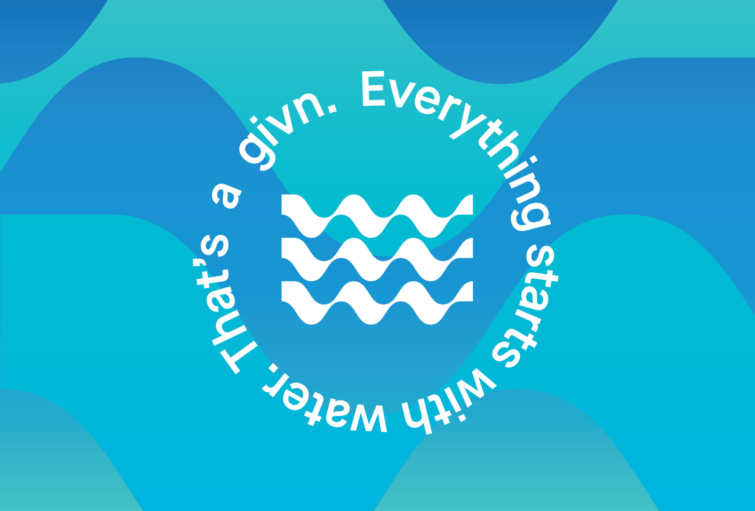
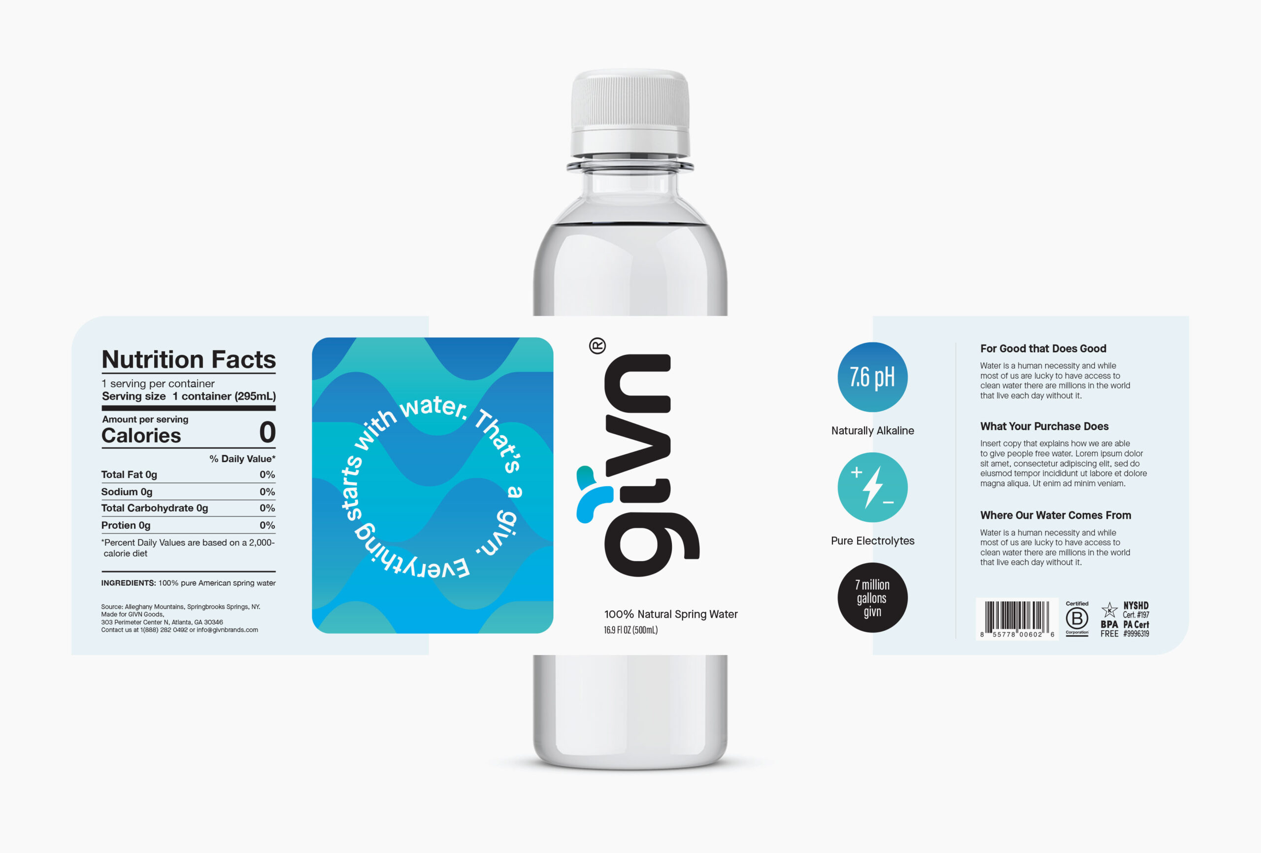
Water is a basic human need that we all require in order to live. As obvious as this is, according to the CDC over 2 billion people don't have access to clean water. Our approach was to frame the brand positioning around this self-evident idea through the tagline:
Everything starts with water. That's a givn.
Everything starts with water. That's a givn
Everyone should have access to clean water. That's a givn
We can do more together. That's a givn
We developed the Verbal ID around this scalable nomenclature, turning it into an obvious and consistent consumer facing statement.
The main goal was to provide all departments within the company greater accessbility and ease of creating their own marketing and promotional materials without reliance on the creative team.
The givn™ brand has seen several iterations since its initial launch. However, even through these rebrands the visual identity lacked a meaningful visual story that connected to the mission driving the company.
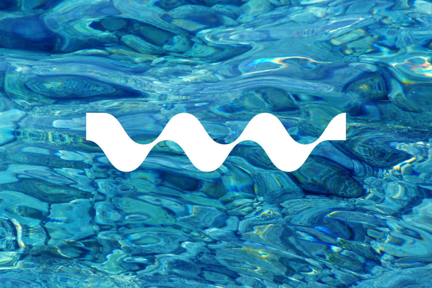
I built a story that would connect their present equity with a visual story oriented around the following: where water comes from, what water looks like and an emotive symbol.
The givn™ brand has seen several iterations since its initial launch. However, even through these rebrands the visual identity lacked a meaningful visual story that connected to the mission driving the company.
I built a story that would connect their present equity with a visual story oriented around the following: where water comes from, what water looks like and an emotive symbol.
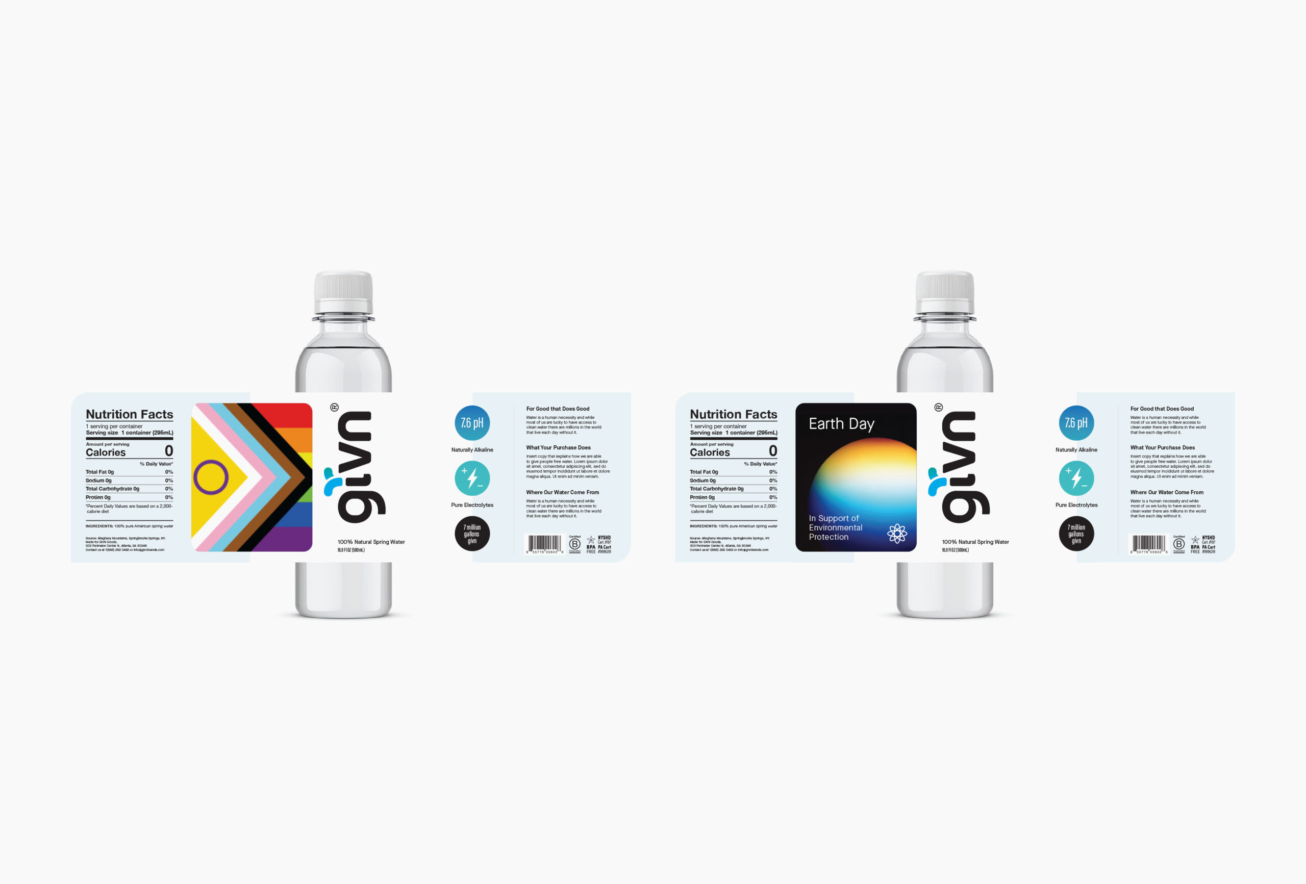
Given that givn™ created new label designs for partnerships and events it seemed overtly cumbersome to redo the lable from end-to-end for each. I built a template with a dedicated partnership window where content could be easily swapped in and out without having to change the design or worry about setting up new print mechanicals and lead times.
Given that givn™ created new label designs for partnerships and events it seemed overtly cumbersome to redo the lable from end-to-end for each. I built a template with a dedicated partnership window where content could be easily swapped in and out without having to change the design or worry about setting up new print mechanicals and lead times.
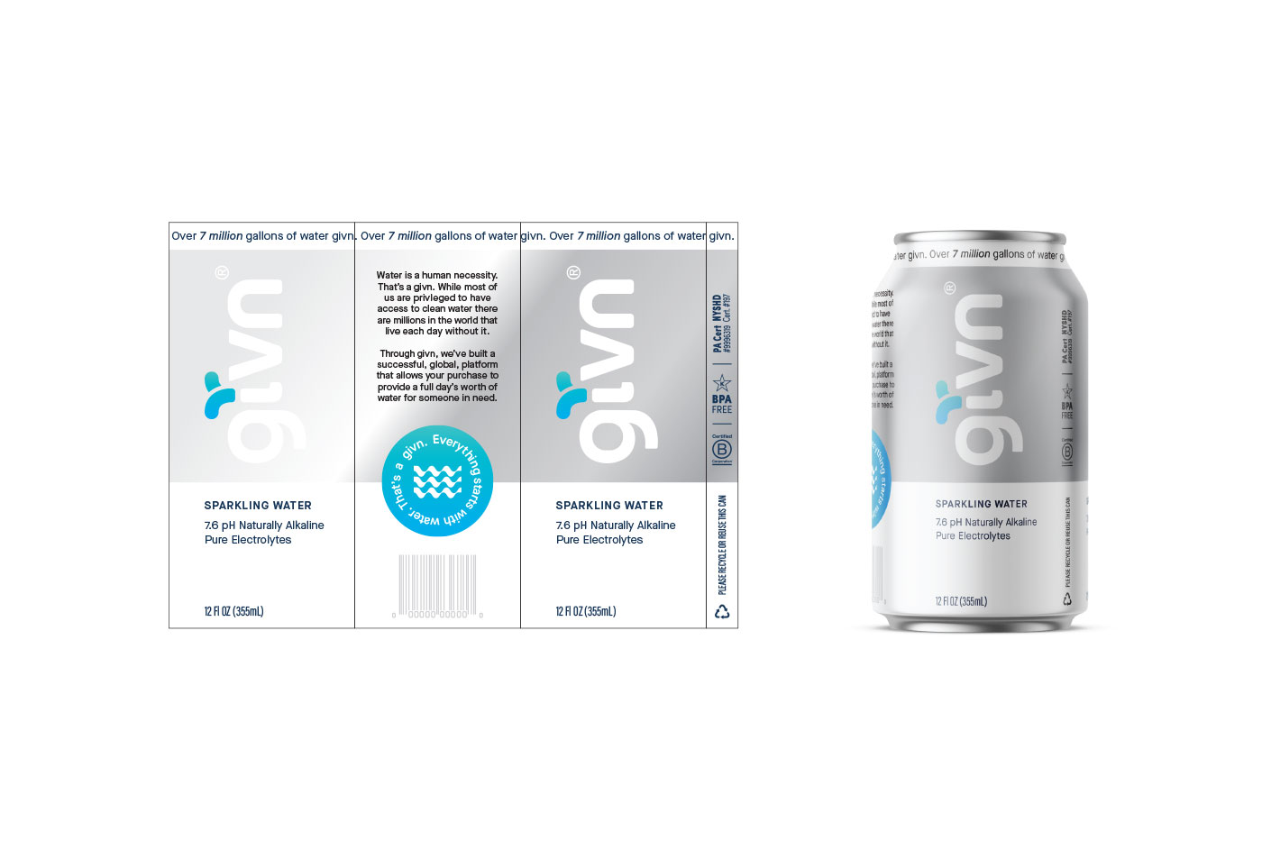
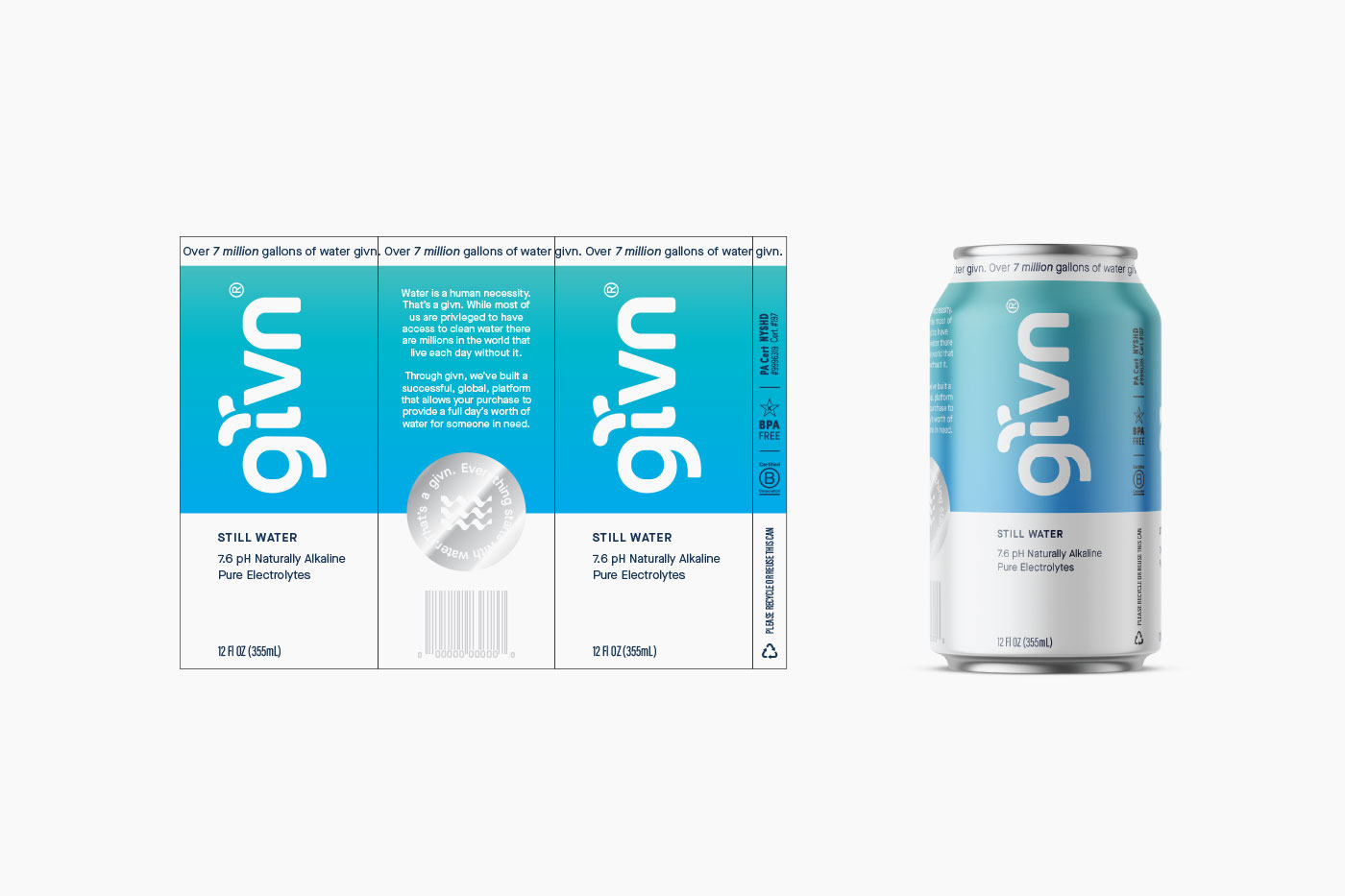
Eventually, due to supply chain issues and vendor requests, we had to explore doing an aluminum can version.
Eventually, due to supply chain issues and vendor requests, we had to explore doing an aluminum can version.
Moon Powered