Nutrafol
Evology
Nutrafol
Founded in 2015, Nutrafol, a hair wellness company, helps consumers hair to ‘Keep Growing’. Their products, in alignment with their mission, are aimed at building healthy hair from within, with a specific focus on the issues of hair thinning and loss.
As a platform for change, they facilitate access and understanding, connecting science and people in meaningful ways. Everything they do is through this lens, and the approach to packaging should be no different.
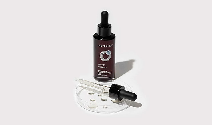
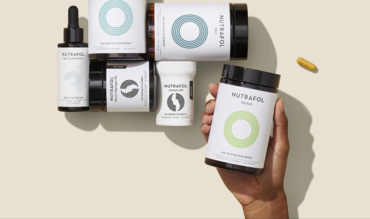
The project was to explore how Nutrafol could more effectively lead the hair wellness category through an intuative, scalable and ownable brand product experience. Aligned with their new pipeline strategy two new products were introduced, Boosters and a Topical, targeted at two key sales channels:
Direct to consumer (via Nutrafol.com and Amazon) Professional partners (Primary Care Physicians, MedSpa / aestheticians, Dermatologists, Plastic Surgeons, Stylists and high end salons)
Role:
Creative Director
Responsibilities:
Art Direction, Client Management, Brand Identity, Packaging, Strategy, Production
Client:
Nutrafol
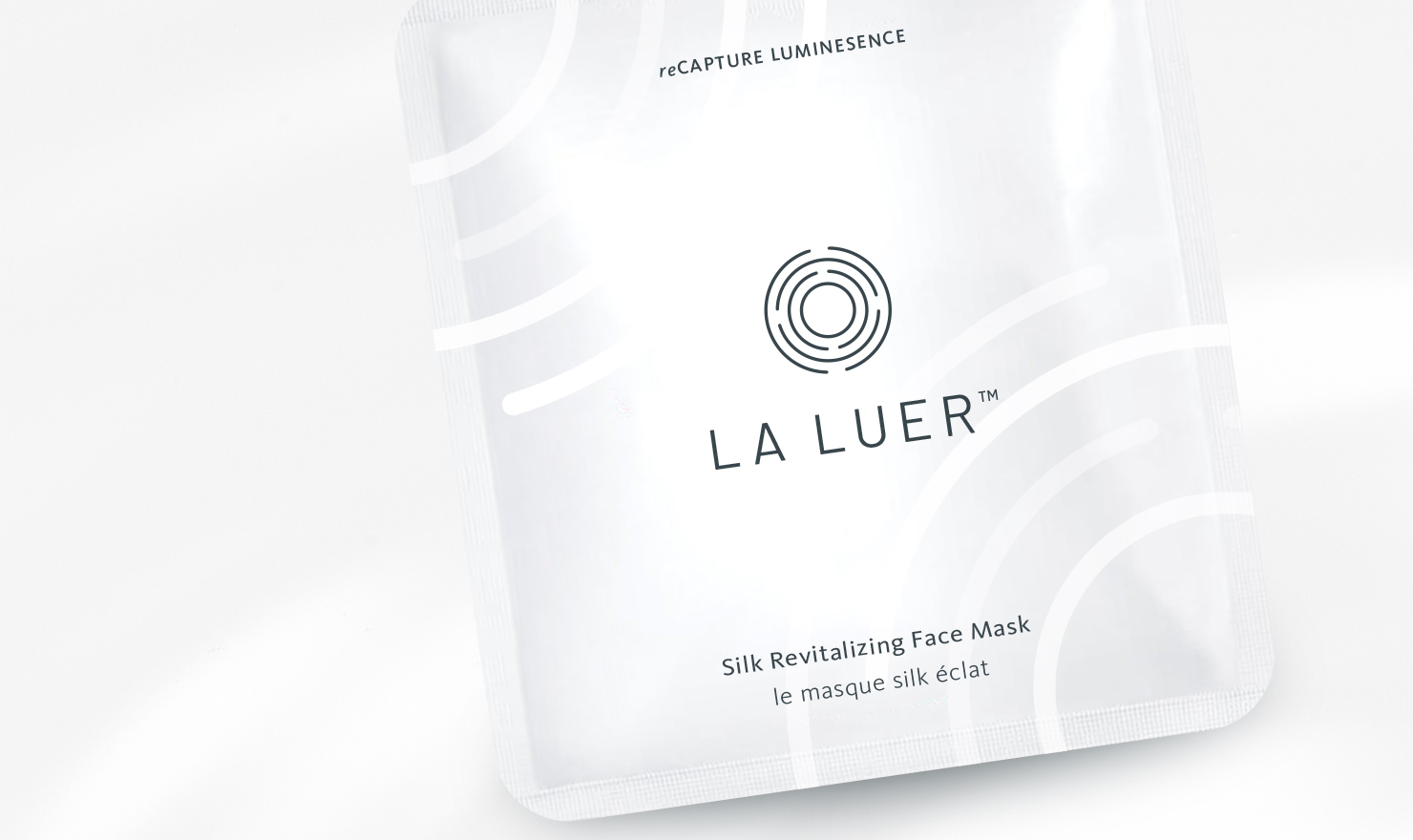
Brief: Los Angeles base company LA LUER is a skincare brand focused on an at-home tool and products that are convenient and easy to use. CEO and Owner, Nicole Chan developed "MIRA," a smart device that guides you through a simple beauty routine that is effective and efficient in helping you get results for healthy, radiant skin.
We started by defining the scope of her market; location, demographics, SWOT analysis... and more. Since her primary sales channel was B2B wholesale it influenced the immediate identity and collateral needs of the brand. From there we leveraged the technical idea behind her products to create a brand story and visual identity founded on the premise "progression of refinement."
Role:
Freelance Designer
Responsibilities:
Brand Identity, Packaging Design, Client
Management
Client:
La Luer
Brief: Los Angeles base company LA LUER is a skincare brand focused on an at-home tool and products that are convenient and easy to use. CEO and Owner, Nicole Chan developed "MIRA," a smart device that guides you through a simple beauty routine that is effective and efficient in helping you get results for healthy, radiant skin.
We started by defining the scope of her market; location, demographics, SWOT analysis... and more. Since her primary sales channel was B2B wholesale it influenced the immediate identity and collateral needs of the brand. From there we leveraged the technical idea behind her products to create a brand story and visual identity founded on the premise "progression of refinement."
.
Role:
Freelance Designer
Responsibilities:
Brand Identity, Packaging Design, Client Management
Client:
La Luer
Founded in 2015, Nutrafol, a hair wellness company, helps consumers hair to ‘Keep Growing’. Their products, in alignment with their mission, are aimed at building healthy hair from within, with a specific focus on the issues of hair thinning and loss.
As a platform for change, they facilitate access and understanding, connecting science and people in meaningful ways. Everything they do is through this lens, and the approach to packaging should be no different.
The project was to explore how Nutrafol could more effectively lead the hair wellness category through an intuative, scalable and ownable brand product experience. Aligned with their new pipeline strategy two new products were introduced, Boosters and a Topical, targeted at two key sales channels:
Direct to consumer (via Nutrafol.com and Amazon) Professional partners (Primary Care Physicians, MedSpa / aestheticians, Dermatologists, Plastic Surgeons, Stylists and high end salons)
Role:
Creative Director
Responsibilities:
Art Direction, Client Management, Brand Identity, Packaging, Strategy, Production
Client:
Nutrafol
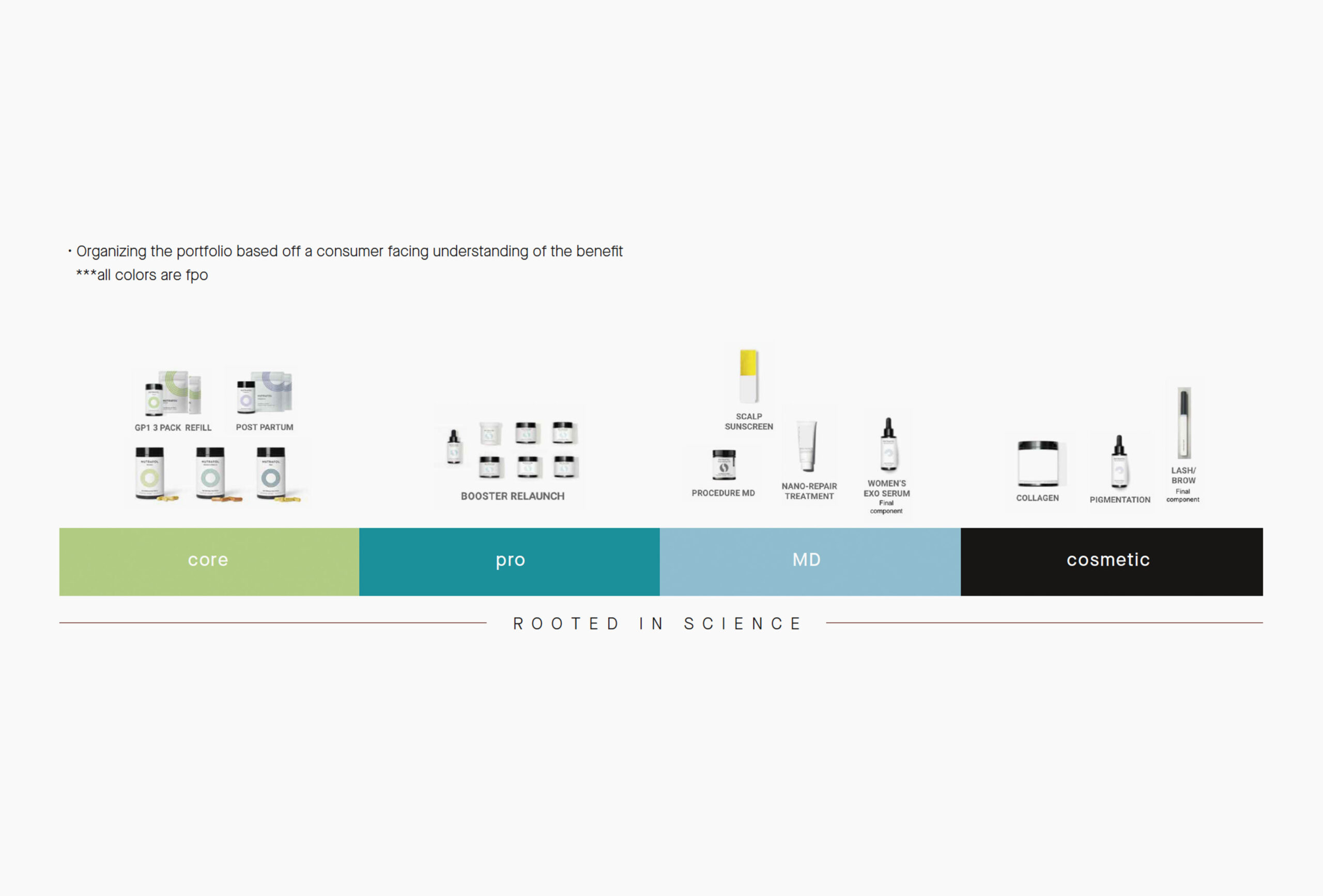
We started by evalutating the current and future product landscape in the Nutrafol pipeline. Understanding current needs and envisioning where the brand could grow.
These were our primary considerations as we were working through the strategy, architecture and exploratory design phases of the Topical project:
• Strategy to inform design
• Clear system extension
• Intuative nomenclature
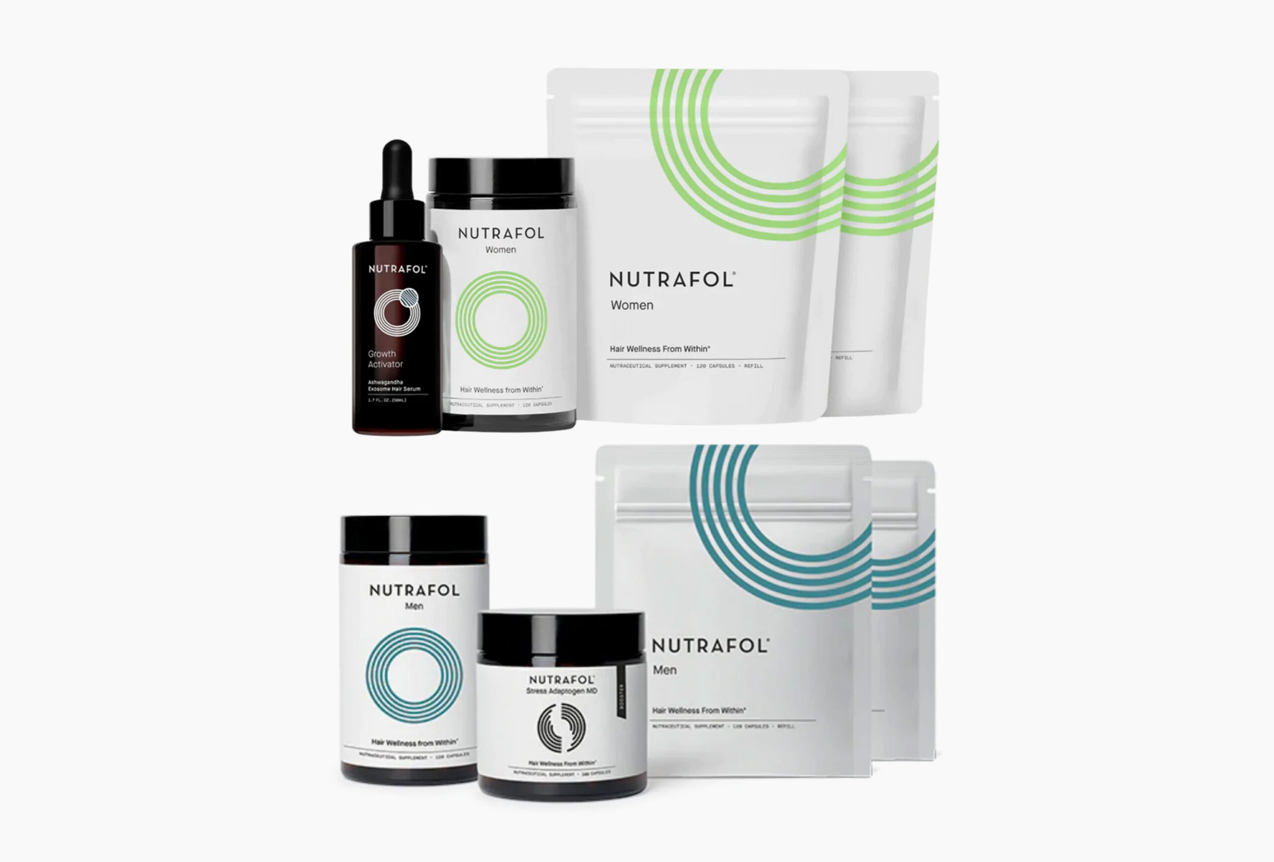
• Visual relationship between Core and Topical
• Elevate design for a more premium feel
• Communicate emotive, well being and science
• Develop a flexible/scalable system with a vision for future growth
• Ensure that primary structure decisions are made with intent per platform, but also feel like part of the entire portfolio
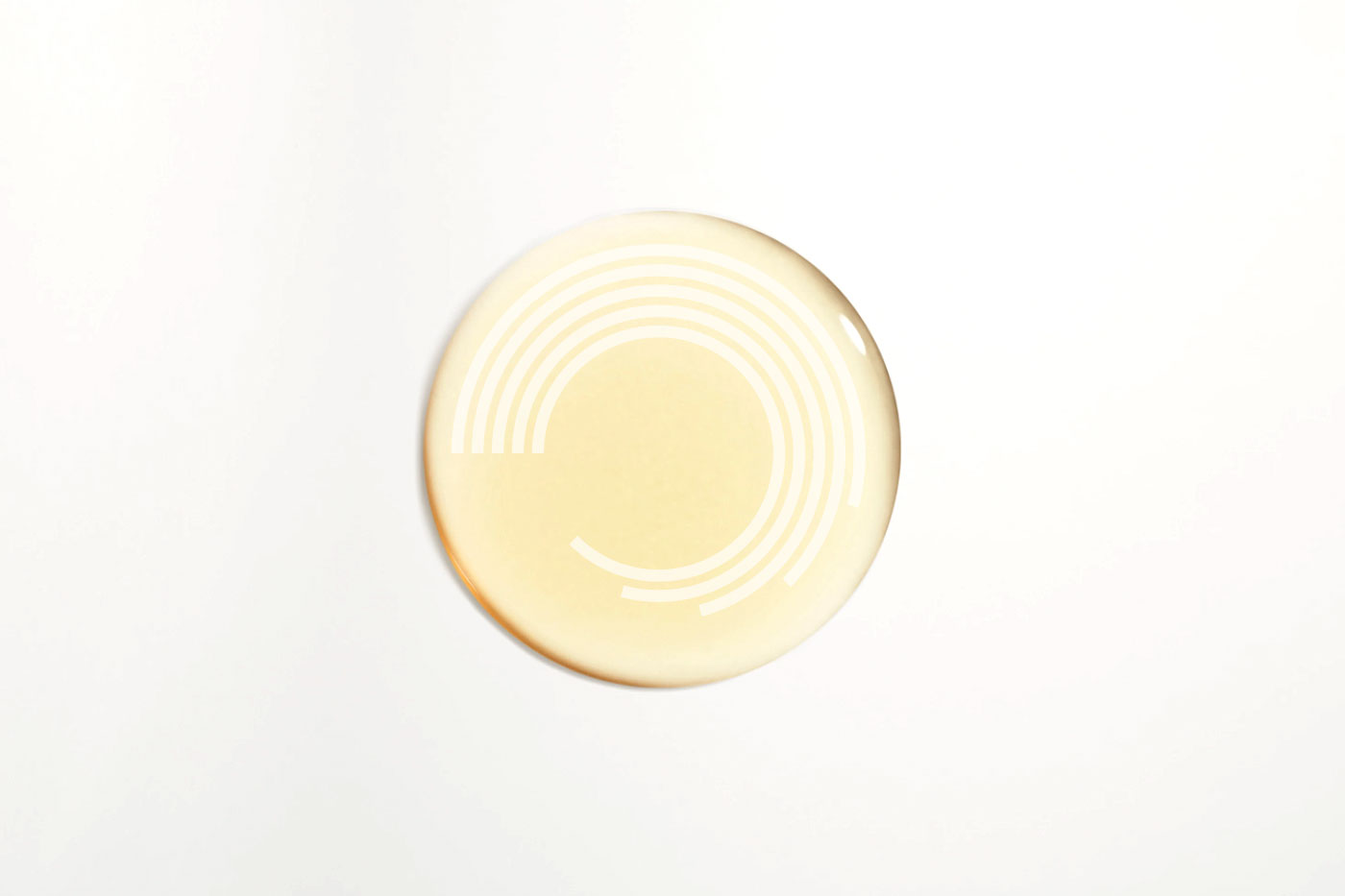
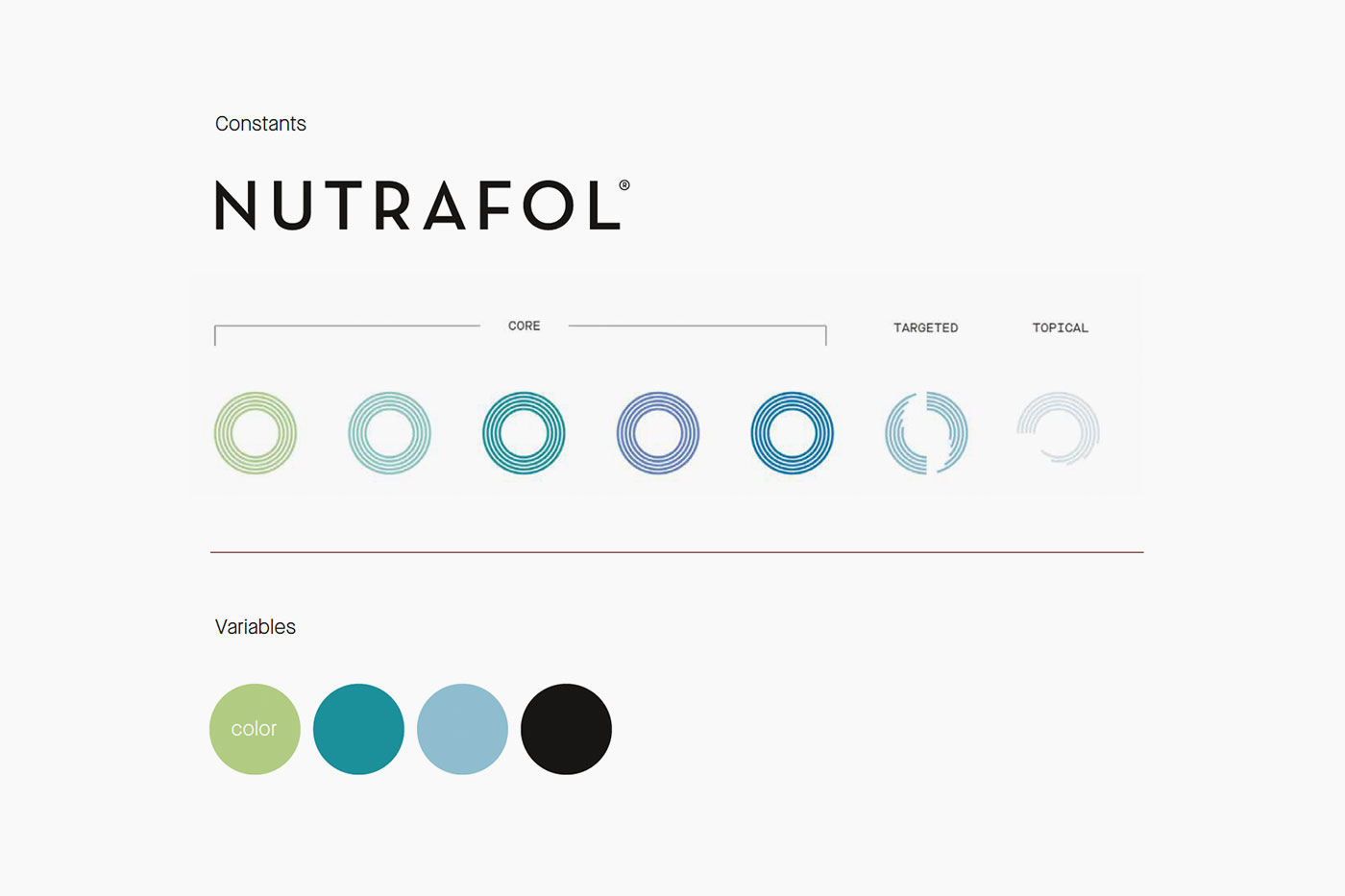
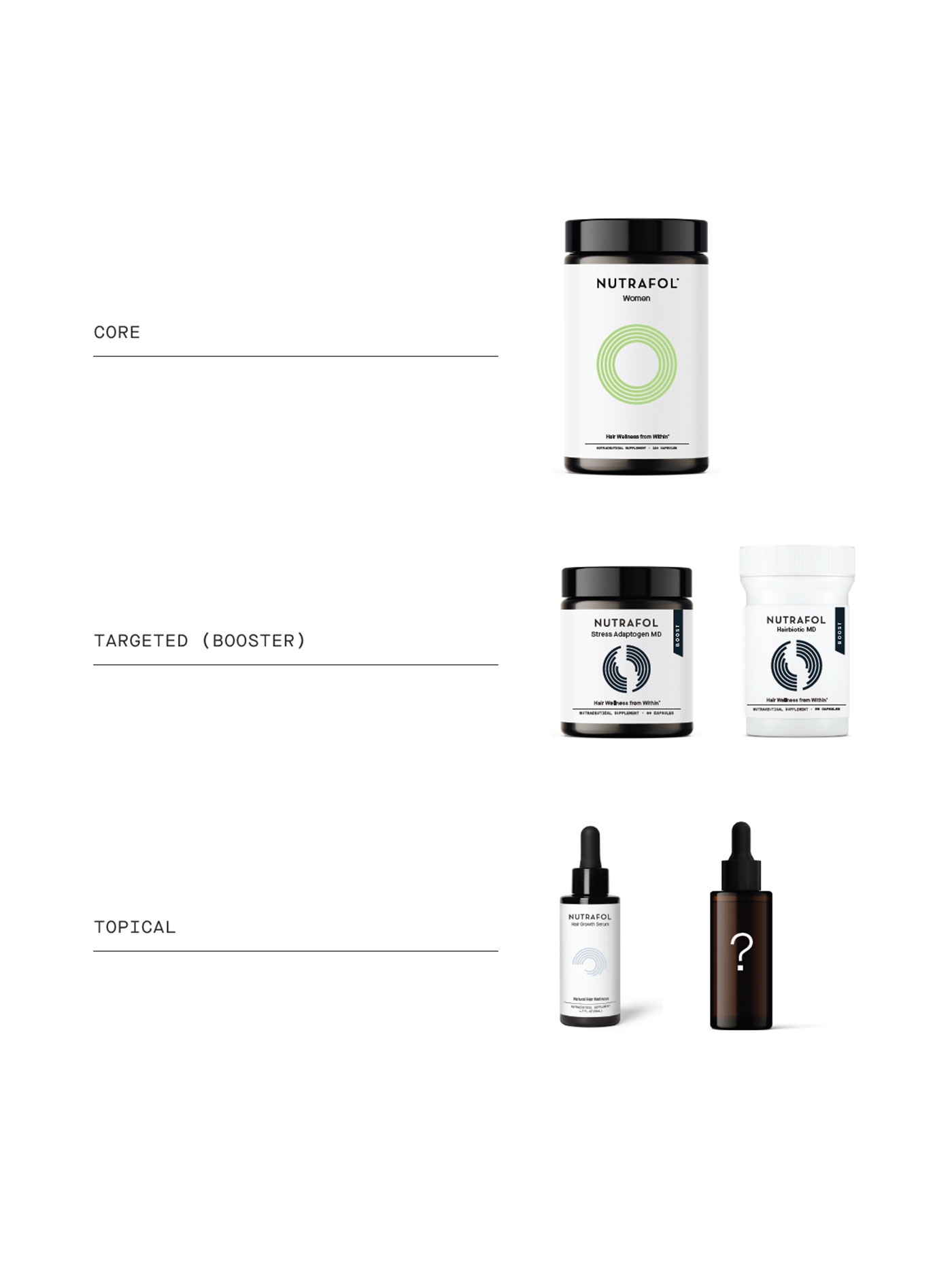
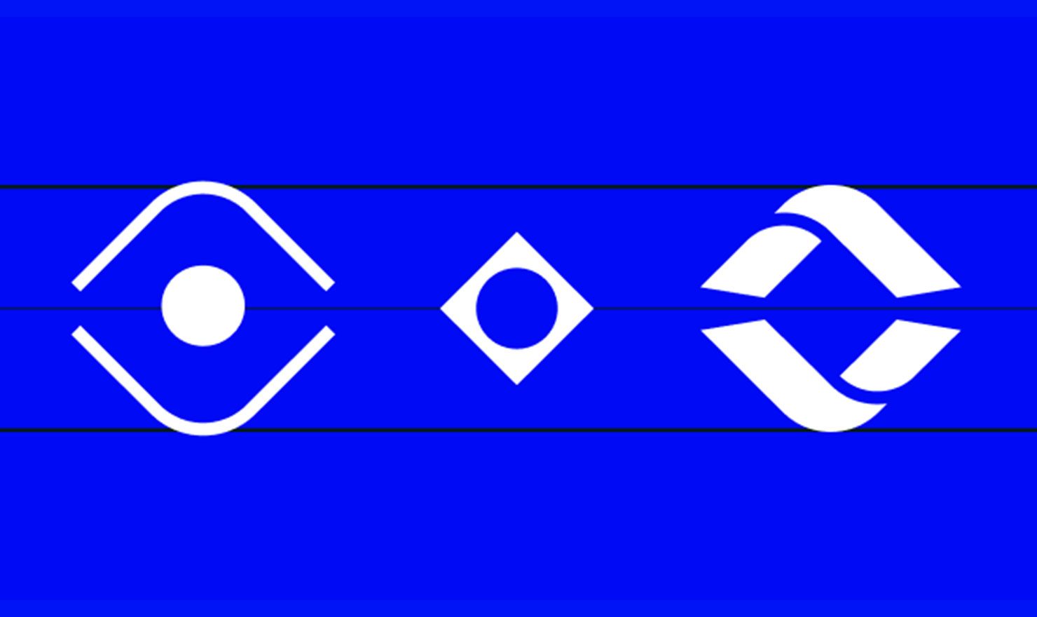
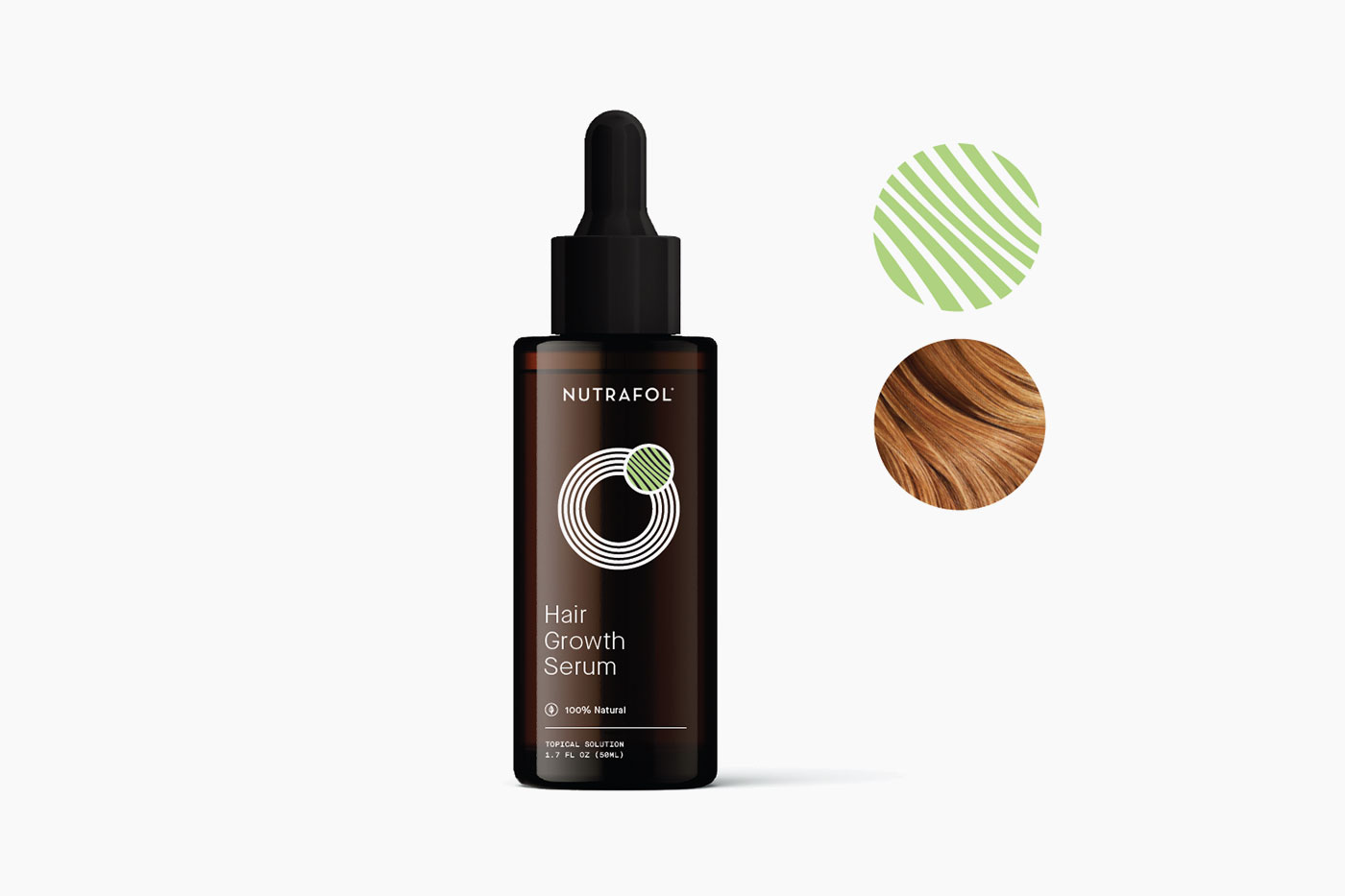
We felt there was a lost opportunity for the rings to tell a visual story They functioned as standalone graphics but by interacting with one another and creating a visual relationship it was easier to demonstrate how the products could work together.
We developed a signature graphic that visually highlights what the product does for the scalp. Leaning into consumer benefits. This modification within the same graphic style is how we built on the topical family but still kept it cohesive.
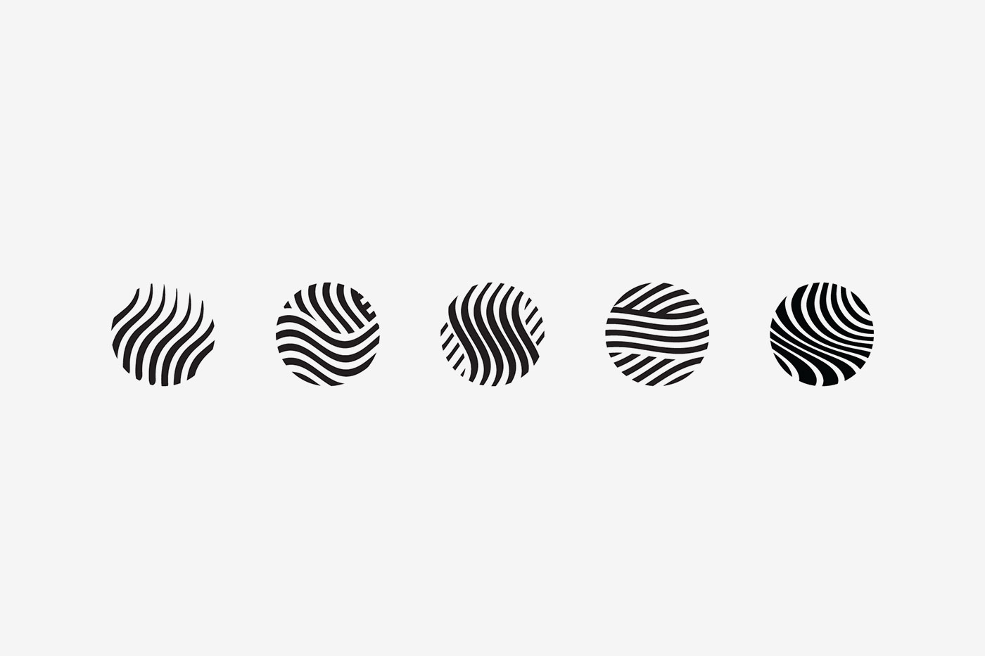
Exploratory work
Exploratory work

Moon Powered

