Zium
Evology
Zium
Brief: Zium, an early stage investment firm, focused on series A tech enterprise startups, aims to disrupt the venture capitalist culture in Korea by building a supportive community to help the next generation of Korean entrepreneurs. They are continuing Korea’s long tradition of forward thinking in technology while working towards building a more diverse Korean economy.
The goal of this project was to strategize, explore and develop a comprehensive brand for Zium Ventures Co., Ltd. that would reflect their vision of building a new type of Korean VC fund.
Throughout our Mood World exploration we leaned heavily into the visual legacy of Korean culture and the idea of colalboration and change. The full brand is still in development but the hero image showcases the present direction.
Role:
Creative Director
Responsibilities:
Art Direction, Brand Identity, Client Management, Concept Development, Content Development, Ideation, Packaging, Production
Client:
Zium Ventures Co., Ltd.
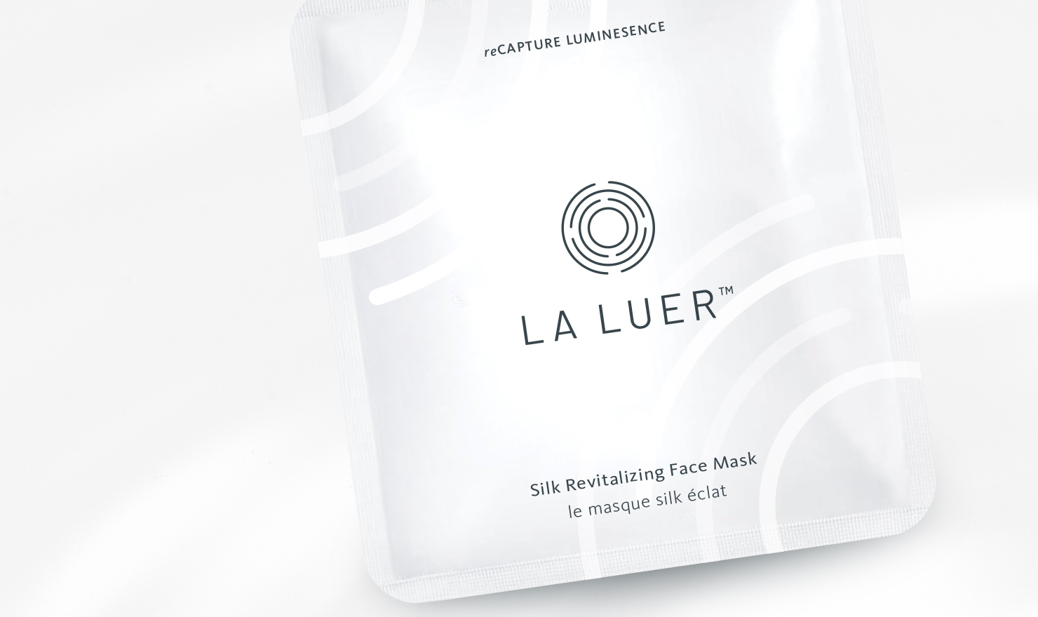
Brief: Los Angeles base company LA LUER is a skincare brand focused on an at-home tool and products that are convenient and easy to use. CEO and Owner, Nicole Chan developed "MIRA," a smart device that guides you through a simple beauty routine that is effective and efficient in helping you get results for healthy, radiant skin.
We started by defining the scope of her market; location, demographics, SWOT analysis... and more. Since her primary sales channel was B2B wholesale it influenced the immediate identity and collateral needs of the brand. From there we leveraged the technical idea behind her products to create a brand story and visual identity founded on the premise "progression of refinement."
Role:
Freelance Designer
Responsibilities:
Brand Identity, Packaging Design, Client
Management
Client:
La Luer
Brief: Los Angeles base company LA LUER is a skincare brand focused on an at-home tool and products that are convenient and easy to use. CEO and Owner, Nicole Chan developed "MIRA," a smart device that guides you through a simple beauty routine that is effective and efficient in helping you get results for healthy, radiant skin.
We started by defining the scope of her market; location, demographics, SWOT analysis... and more. Since her primary sales channel was B2B wholesale it influenced the immediate identity and collateral needs of the brand. From there we leveraged the technical idea behind her products to create a brand story and visual identity founded on the premise "progression of refinement."
.
Role:
Freelance Designer
Responsibilities:
Brand Identity, Packaging Design, Client Management
Client:
La Luer
Brief: Zium, an early stage investment firm, focused on series A tech enterprise startups, aims to disrupt the venture capitalist culture in Korea by building a supportive community to help the next generation of Korean entrepreneurs. They are continuing Korea’s long tradition of forward thinking in technology while working towards building a more diverse Korean economy.
The goal of this project was to strategize, explore and develop a comprehensive brand for Zium Ventures Co., Ltd. that would reflect their vision of building a new type of Korean VC fund.
Throughout our Mood World exploration we leaned heavily into the visual legacy of Korean culture and the idea of colalboration and change. The full brand is still in development but the hero image showcases the present direction.
Role:
Creative Director
Responsibilities:
Art Direction, Brand Identity, Client Management, Concept Development, Content Development, Ideation, Packaging, Production
Client:
Zium Ventures Co., Ltd.




Exploratory Work
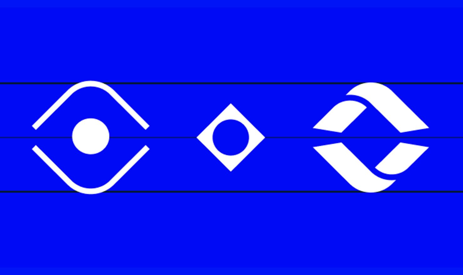
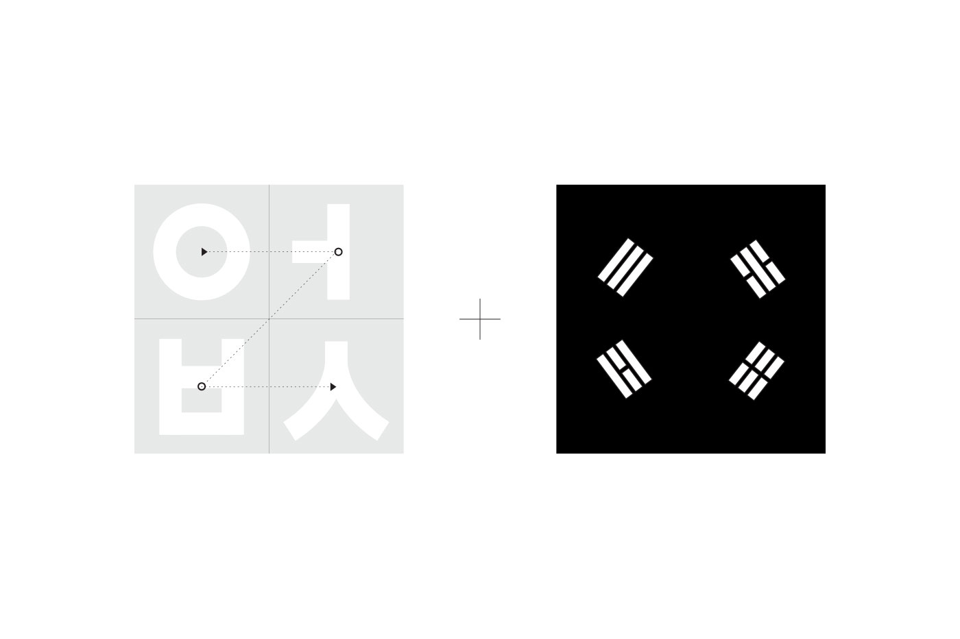
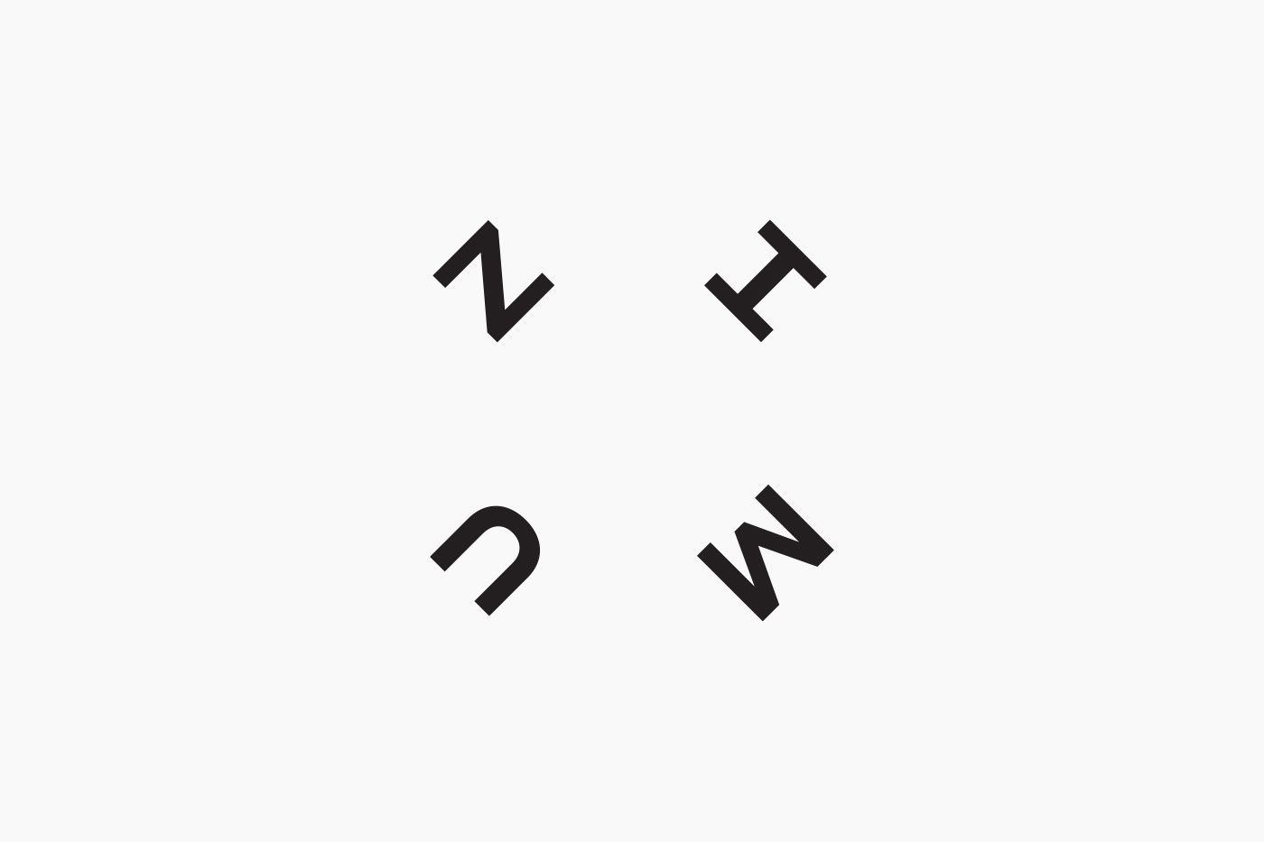
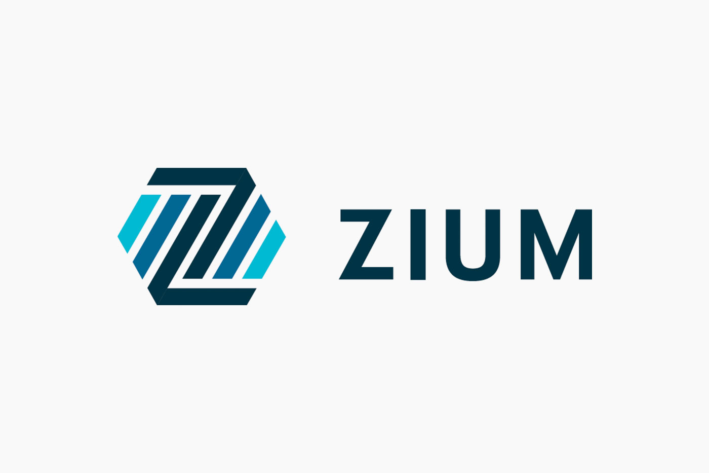
Mood 1: The primary mark is the anchor of the design system and uses the ZIUM letters as a graphic frame demonstrating the company’s confidence through symmetry but also retaining the spirit of “founders first.” The letters combine how Korean, as a language is read, with the markings on the Korean flag to create a mark that is flexible, intuative and iconic.
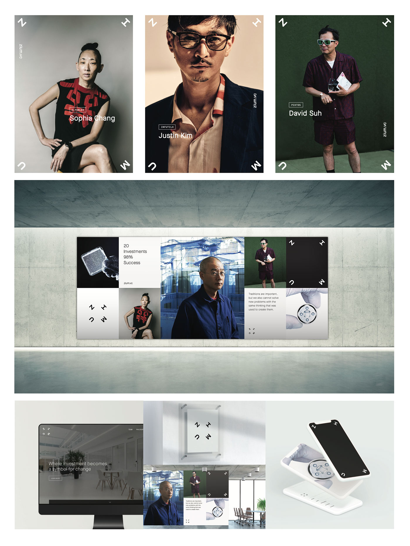
Mood 2: Uses adaptive design to drive the idea of an unspoken understanding between Zium and the companies they invest in. It is intentionally personal, emphasizes important information and is expressive in its forms.
Flexing between storytelleing to expression it connects us to intelligent founders, iconic moments and having something meaningful to say about all of it.
The primary mark extends as a visual “north star” in application, however, still sits in the background and allows the founders of each company to be the hero.
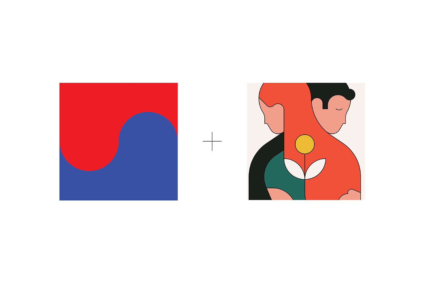
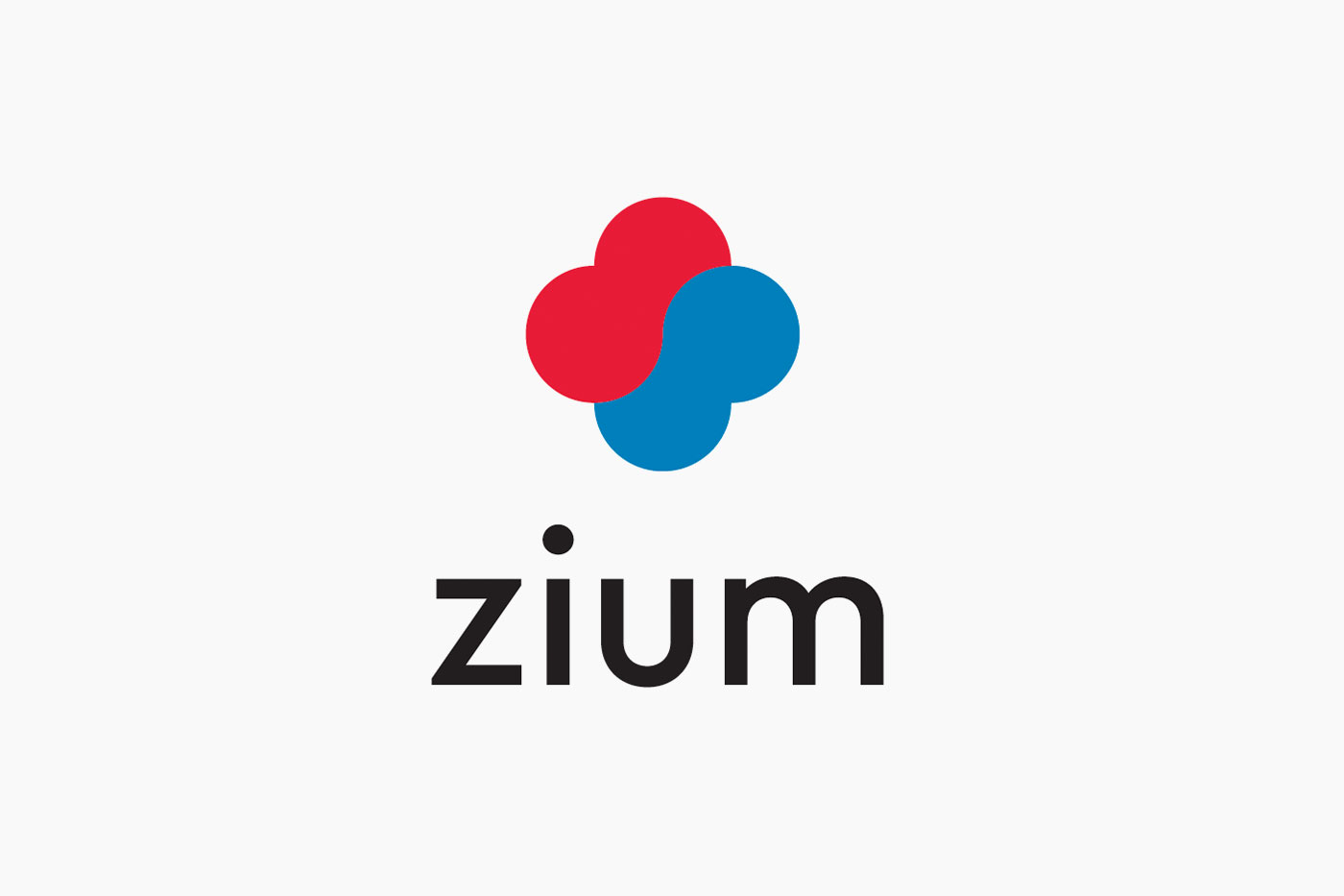
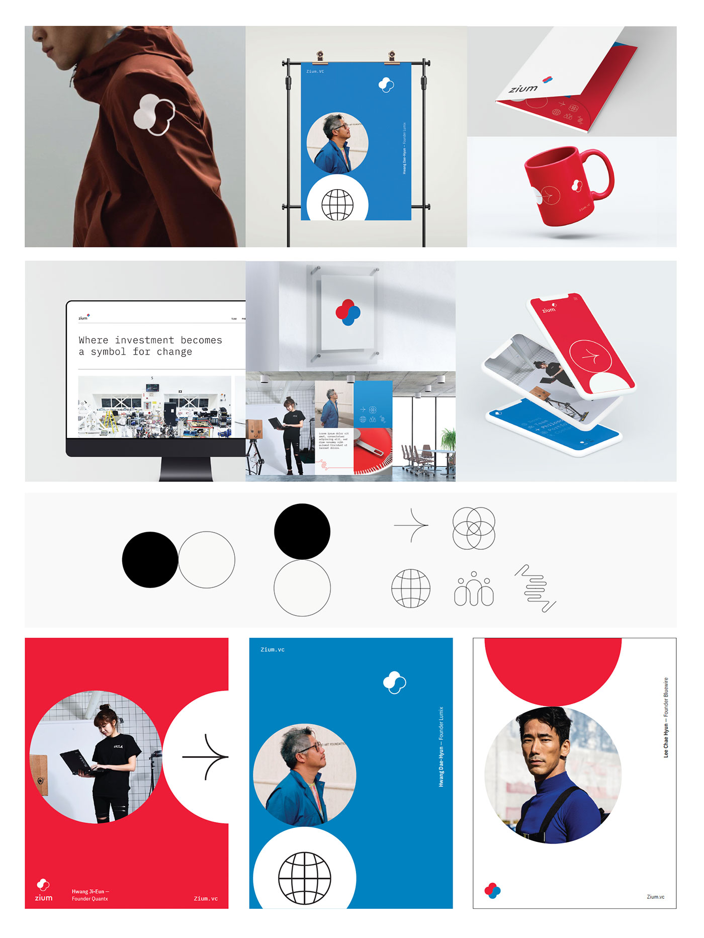
Mood 3: Mood World 3 is bold, dynamic and corporate, which shows Zium’s role in the world, not just as a partner but as a catalyst for positive transformation.
The “Z” is at the heart of the helping hands symbol which stands for the companys commitment to; unity, strength and the relentless pursuit of something better, together.
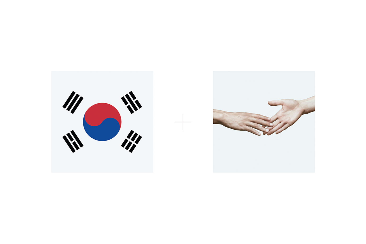
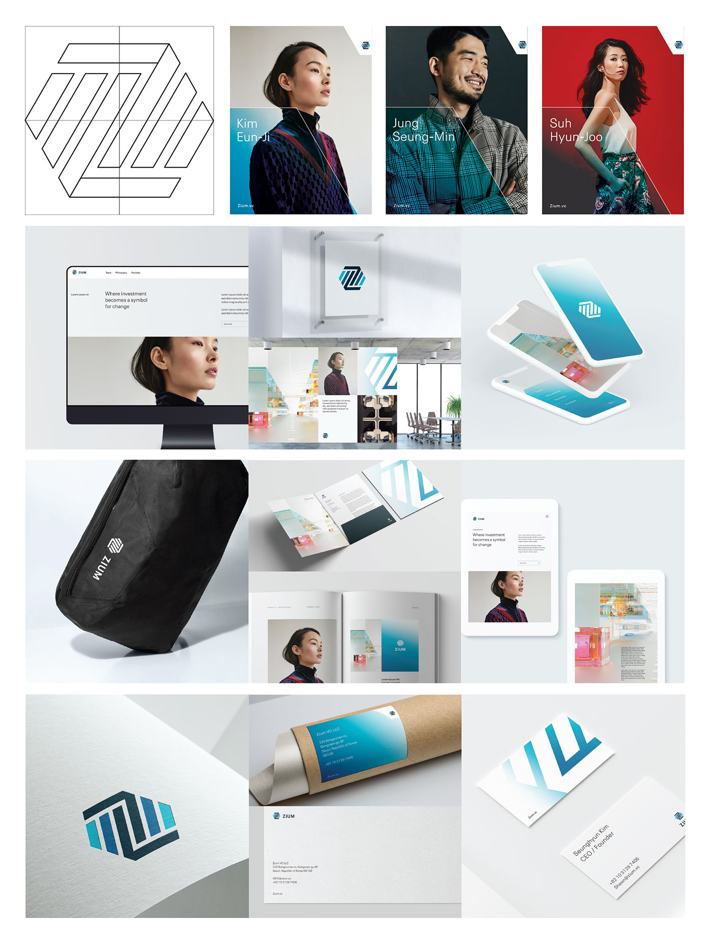
The amplifier uses the primary mark and breaks it into 4 graphic quadrants to be used in a variety of different layouts across different platforms.
The amplifier uses the primary mark and breaks it into 4 graphic quadrants to be used in a variety of different layouts across different platforms.
Moon Powered

