Worker Solutions
Evology
Worker Solutions
Overview: We See what others don't.
Quiet quitting, quiet firing, the great resignation. Whatever you want to call it, one thing is obvious, what employees need and what companies think they want are misaligned.
Worker Solutions, a digitally native platform, harnesses the transformative possibilities of data by delivering solutions on the short-term needs of employees while driving long-term investments for employers.
In a nutshell, Worker Solutions, uses data from proprietary software to gain insight into the problems employee’s are facing and curates real-world solutions to eventually help them achieve financial stability. This is the bread and butter of the business and how we approached building the brand.
Objective(s):
- Launch a Worker Solutions brand within 1.5 months
- Build a digital presence for business validation and fundraising
Approach:
- Focused on fundamental brand elements for fundraising
- Curated verbal and visual content specifically for LPs and B2B
- Organized brand foundation around two ideas: insight and curation
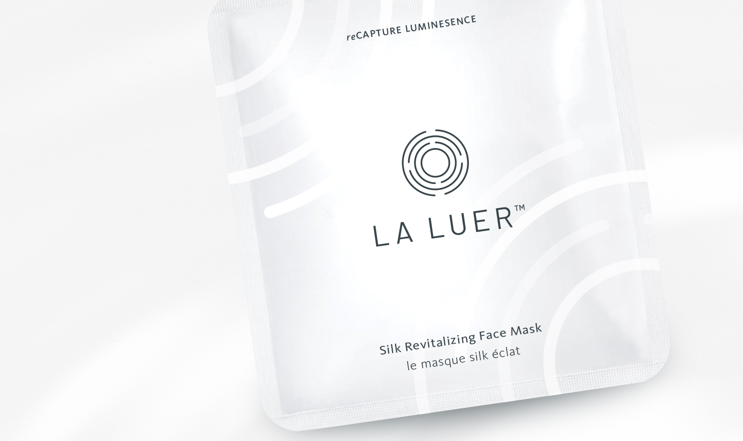
Brief: Los Angeles base company LA LUER is a skincare brand focused on an at-home tool and products that are convenient and easy to use. CEO and Owner, Nicole Chan developed "MIRA," a smart device that guides you through a simple beauty routine that is effective and efficient in helping you get results for healthy, radiant skin.
We started by defining the scope of her market; location, demographics, SWOT analysis... and more. Since her primary sales channel was B2B wholesale it influenced the immediate identity and collateral needs of the brand. From there we leveraged the technical idea behind her products to create a brand story and visual identity founded on the premise "progression of refinement."
Role:
Freelance Designer
Responsibilities:
Brand Identity, Packaging Design, Client
Management
Client:
La Luer
Brief: Los Angeles base company LA LUER is a skincare brand focused on an at-home tool and products that are convenient and easy to use. CEO and Owner, Nicole Chan developed "MIRA," a smart device that guides you through a simple beauty routine that is effective and efficient in helping you get results for healthy, radiant skin.
We started by defining the scope of her market; location, demographics, SWOT analysis... and more. Since her primary sales channel was B2B wholesale it influenced the immediate identity and collateral needs of the brand. From there we leveraged the technical idea behind her products to create a brand story and visual identity founded on the premise "progression of refinement."
.
Role:
Freelance Designer
Responsibilities:
Brand Identity, Packaging Design, Client Management
Client:
La Luer
Overview: We See what others don't.
Quiet quitting, quiet firing, the great resignation. Whatever you want to call it, one thing is obvious, what employees need and what companies think they want are misaligned.
Worker Solutions, a digitally native platform, harnesses the transformative possibilities of data by delivering solutions on the short-term needs of employees while driving long-term investments for employers.
In a nutshell, Worker Solutions, uses data from proprietary software to gain insight into the problems employee’s are facing and curates real-world solutions to eventually help them achieve financial stability. This is the bread and butter of the business and how we approached building the brand.
Objective(s):
- Launch a Worker Solutions brand within 1.5 months
- Build a digital presence for business validation and fundraising
Approach:
- Focused on fundamental brand elements for fundraising
Curated verbal and visual content specifically for LPs and B2B - Organized brand foundation around two ideas: insight and curation
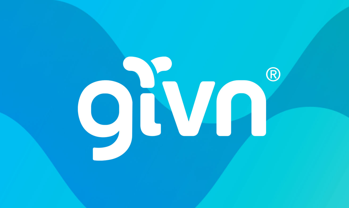
Insight and curation. Two words that were consistent in our interviews with different stakeholders and listening to fundraising pitches given by the WS team. These key ideas lead to the brand concept “We See.” A phrase that captured a unique understanding of real-world employee needs and helped to defined guidelines for design development.
We See
We See data
Not just as a set of numbers
but as a way to create impact
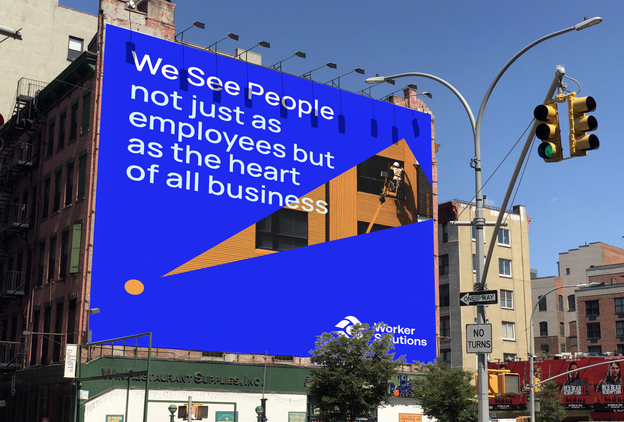
We See people
Not just as employees
but the heart of all business
Insight and curation. Two words that were consistent in our interviews with different stakeholders and listening to fundraising pitches given by the WS team. These key ideas lead to the brand concept “We See.” A phrase that captured a unique understanding of real-world employee needs and helped to defined guidelines for design development.
We See
We See data
Not just as a set of numbers
but as a way to create impact
We See people
Not just as employees
but the heart of all business
Before starting any creative, I’ll typically begin by defining the project goal and breaking that down into managable objectives. By doing so it helps to maintain focus and motivation but also allows us to measure what went well and what didn’t. This helps our team and legacy clients to better prepare for future projects.
The goal for this project was to launch a brand in 1.5 months focused around business validation and fundraising. Originally the timeline was 11 days. (I laughed too). We compromised by adjusting the timeline, project deliverables and allocating a larger budget for the bare necessities: a contrator to execute the logo, an agency for web development and I would handle the rest.
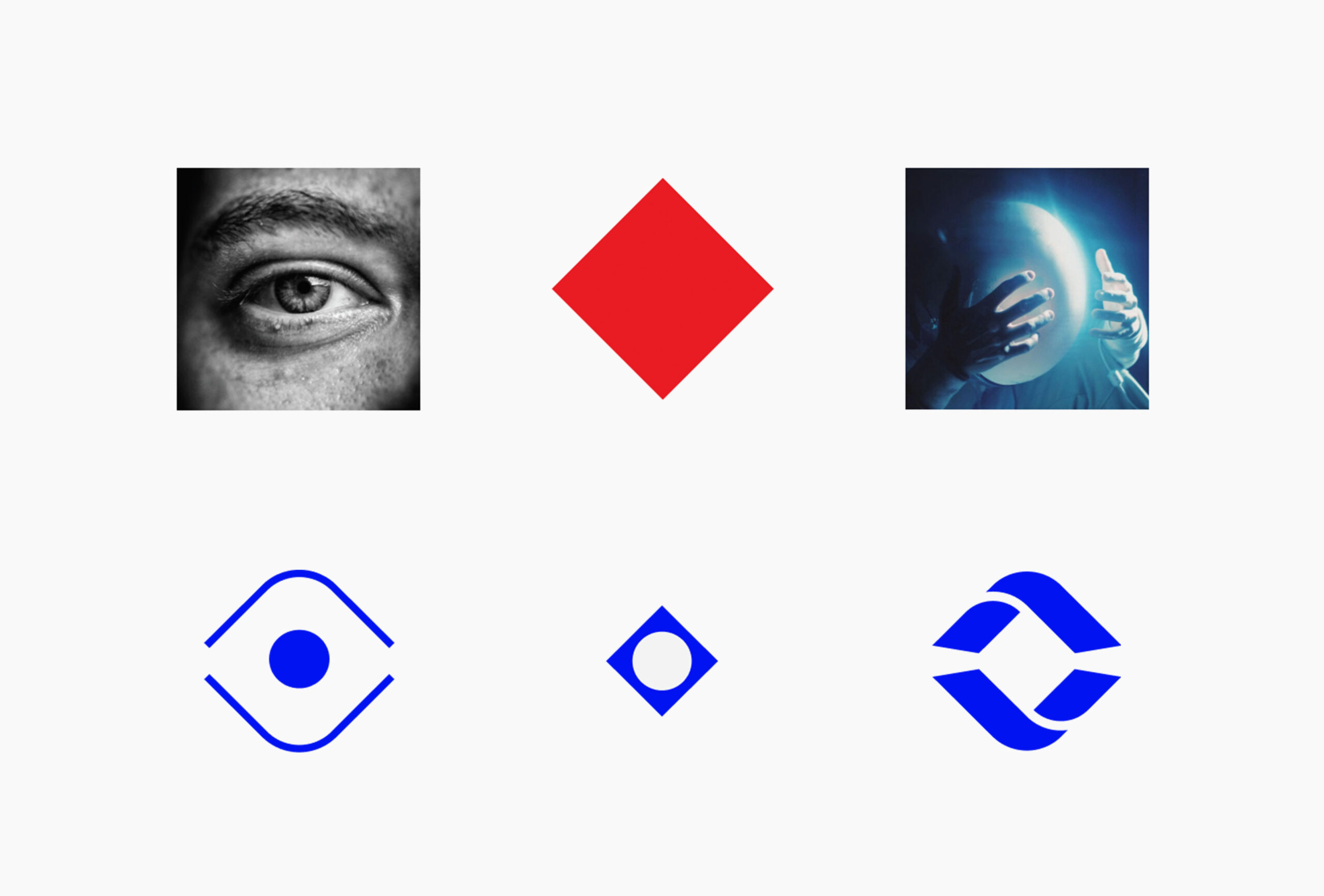
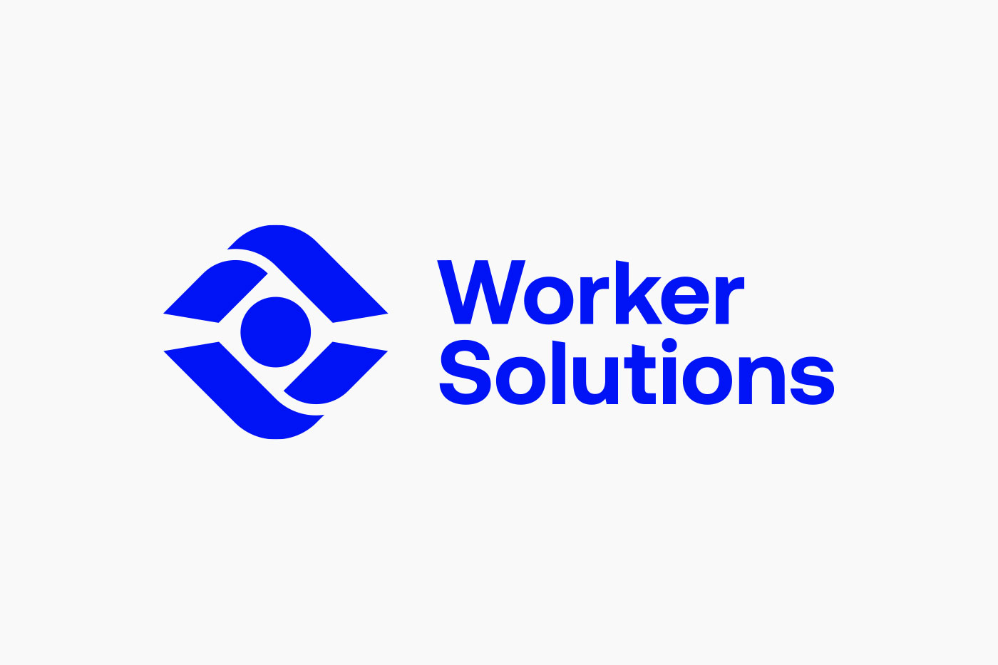
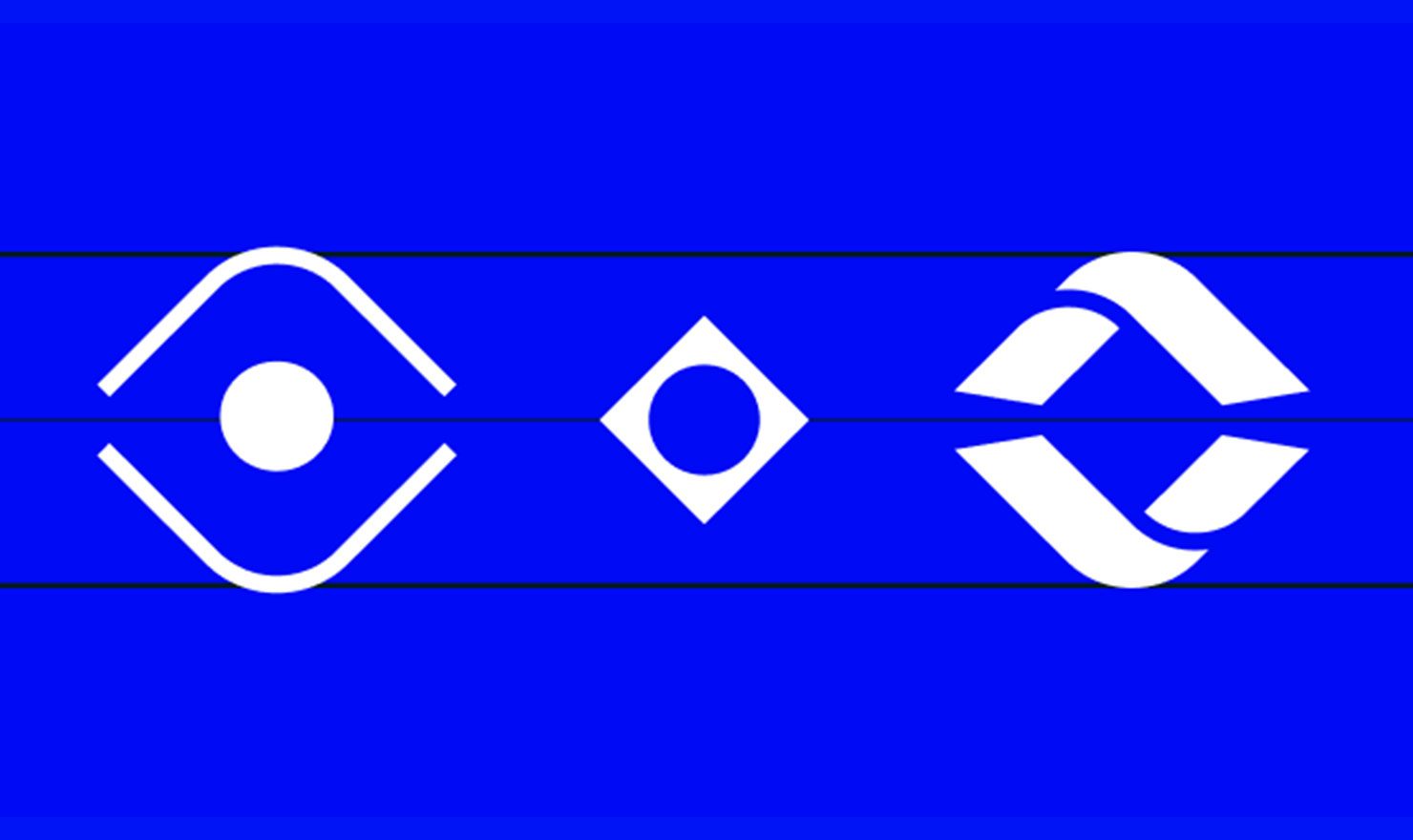
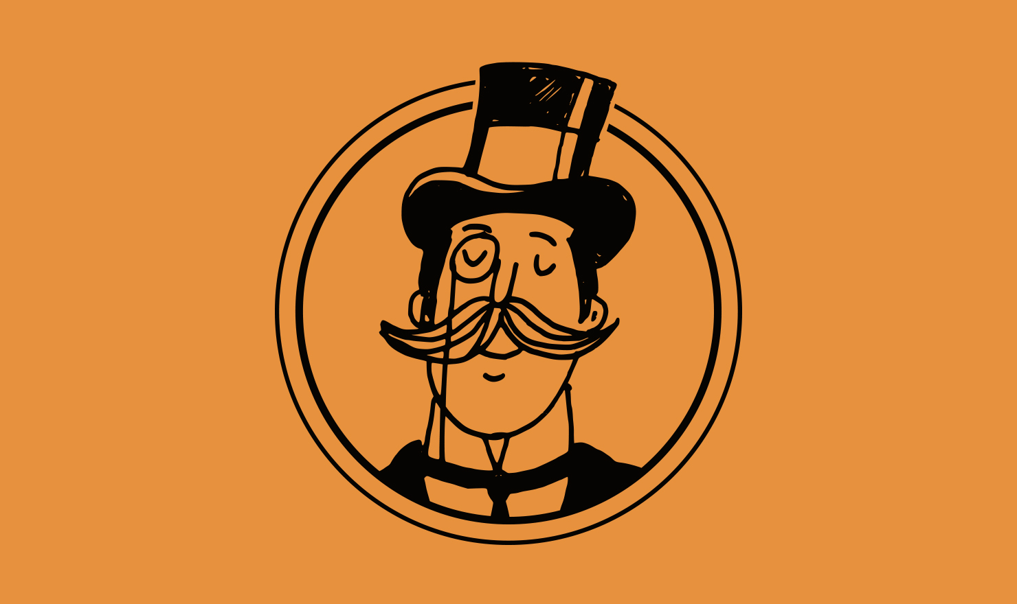
Each individual element communicates a different part of insight and curation. Insight we chose an eye and curation were 2 hands taking care of an object. The diamond in the negative space represents the supergraphic from the parent company Lafayette Square working in the background.
Each individual element communicates a different part of insight and curation. Insight we chose an eye and curation were 2 hands taking care of an object. The diamond in the negative space represents the supergraphic from the parent company Lafayette Square working in the background.
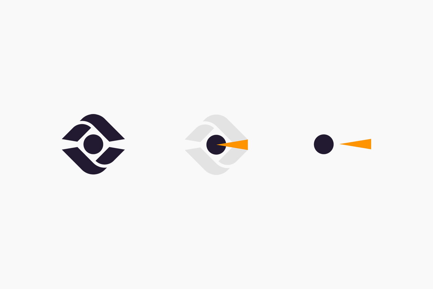
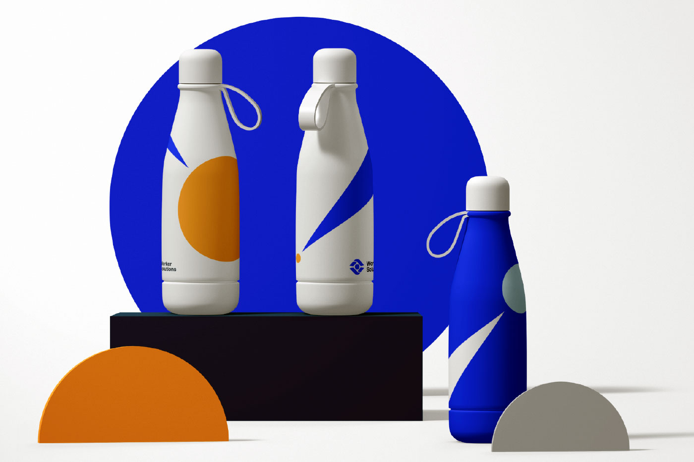
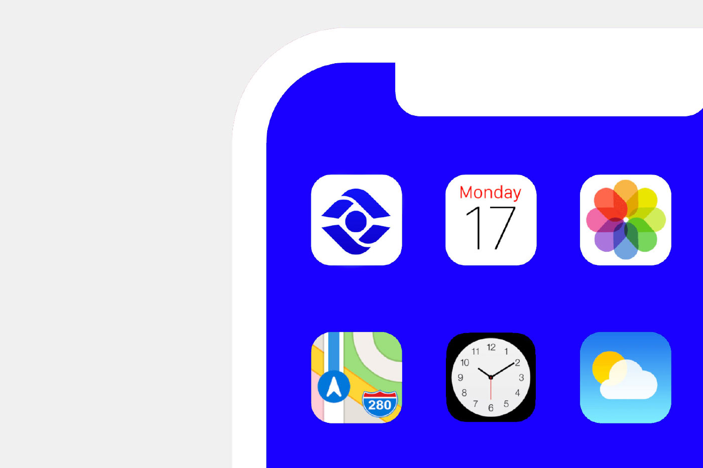
I’m not a huge fan of taking a logo and rescaling it as the primary brand extension. The secondary graphic is an opportunity to futher solidifiy ownability and allow the brand to have more visual flexiblity.
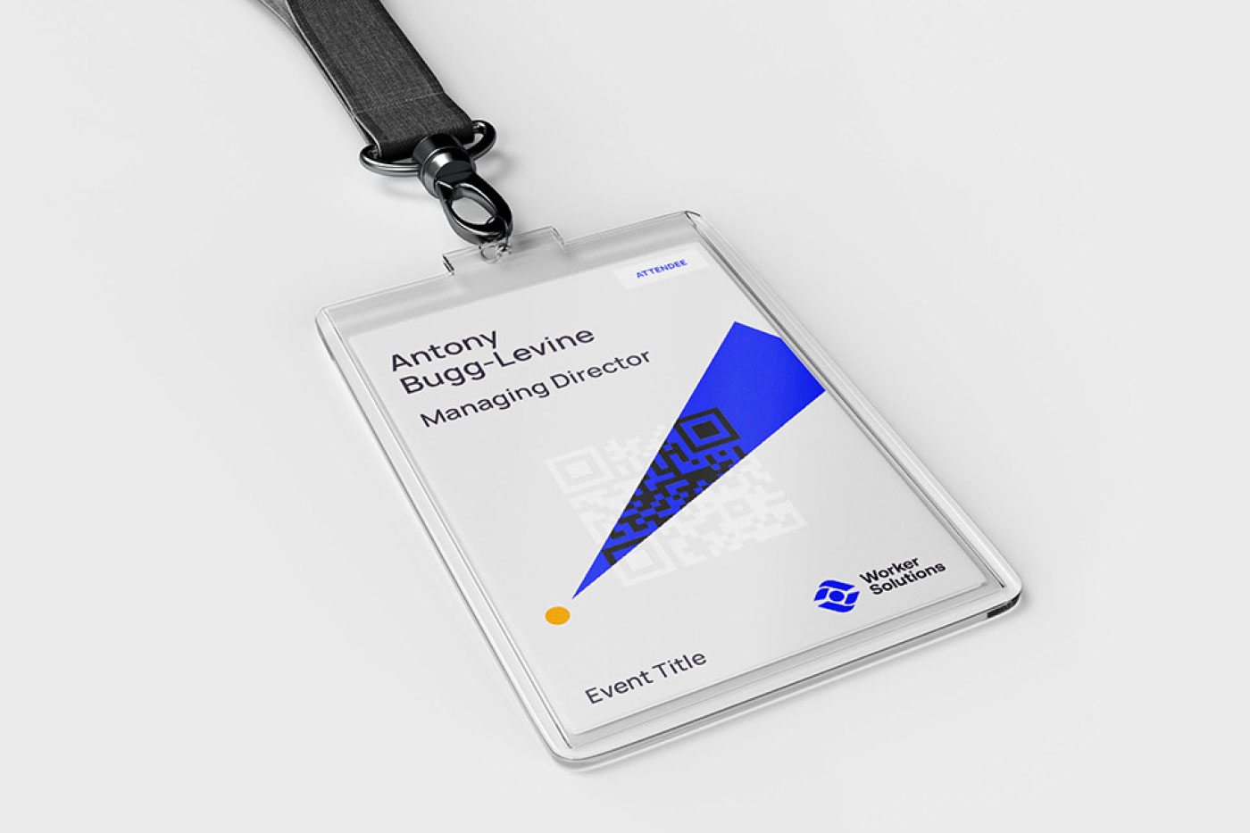
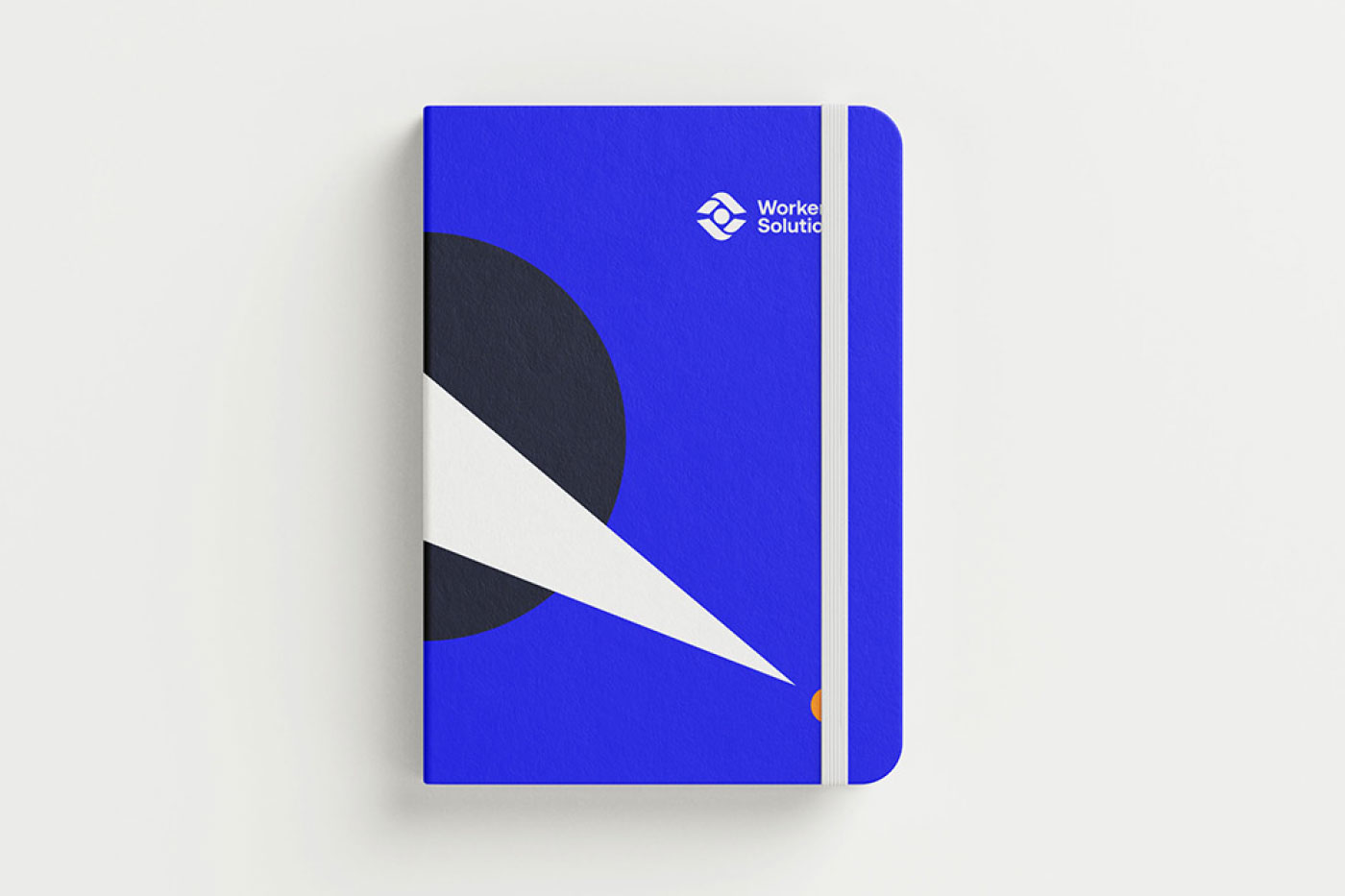
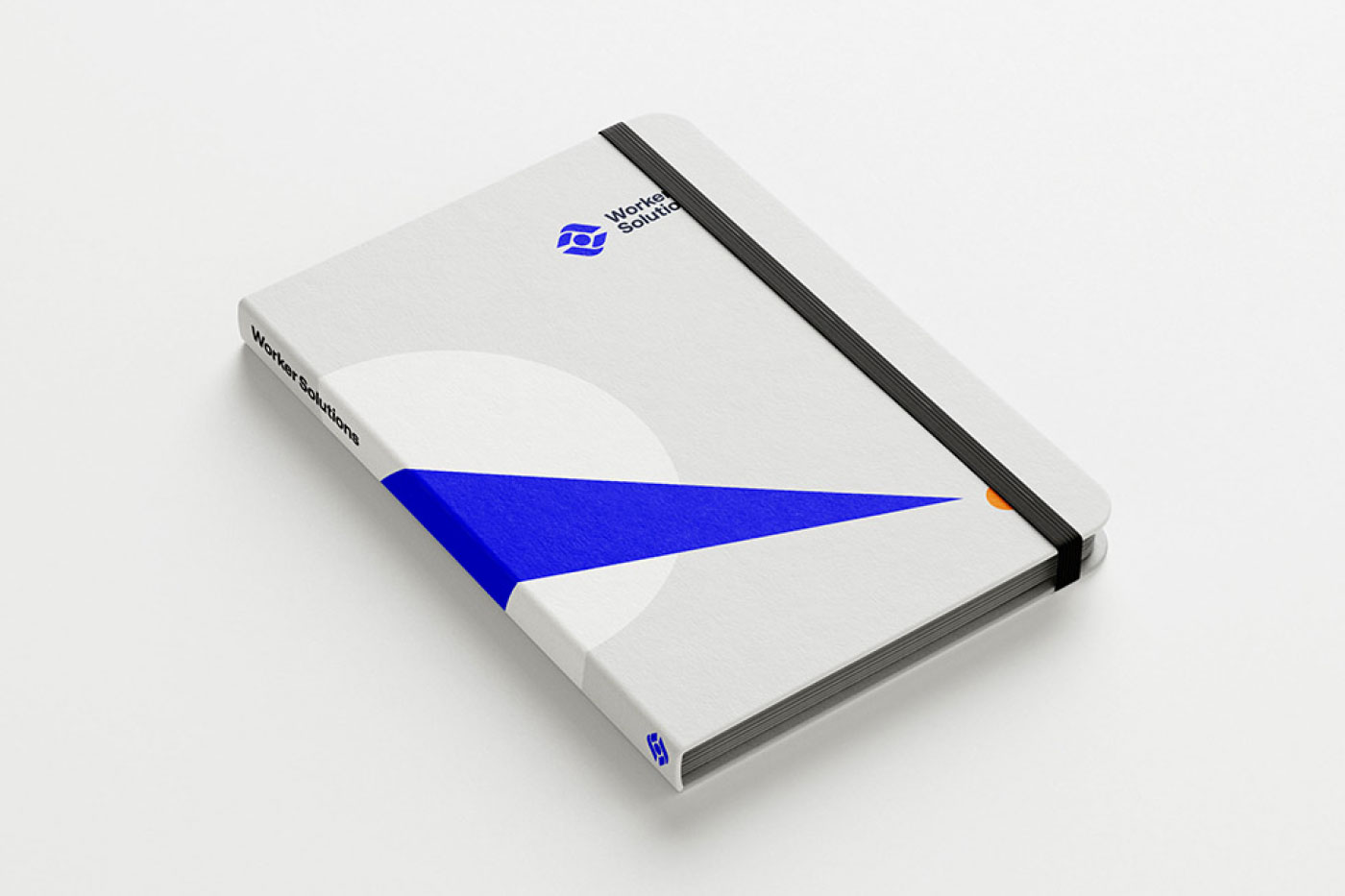
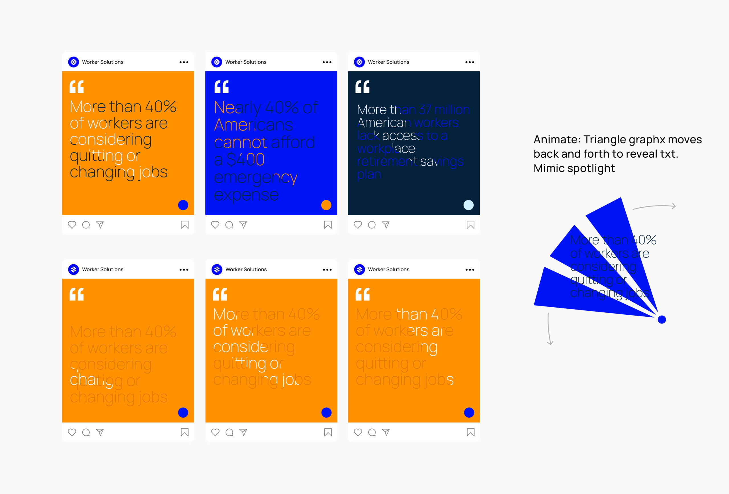
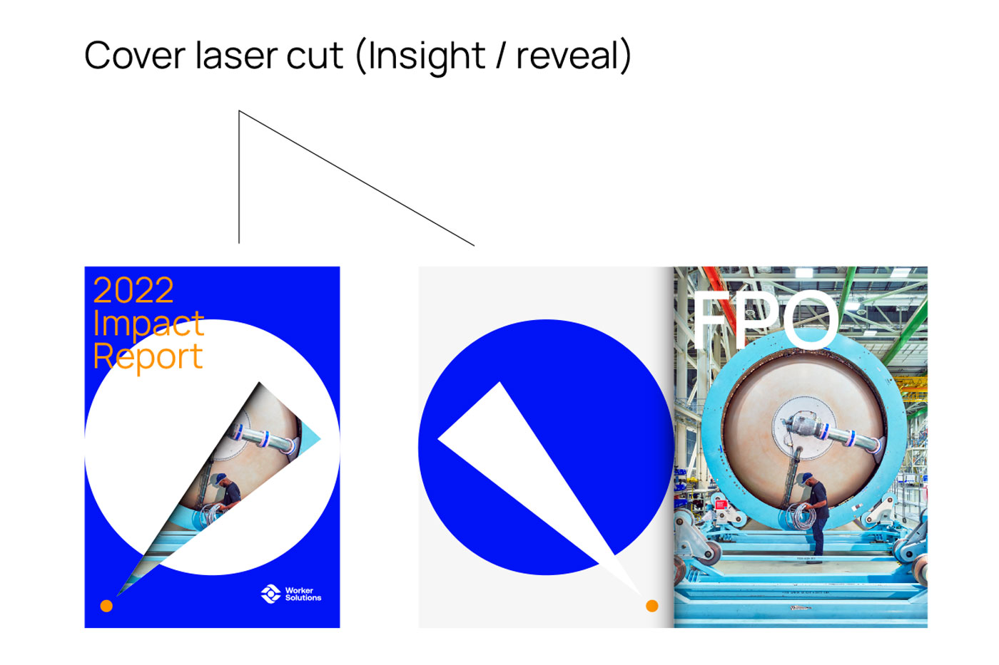
Looked inward to the logo and found that we could extract a “spotlight” shape. Conveniently what do spotlights do? They reveal your environment to help you navigate, sight unseen. This shape ties back into the unique insight WS provides companies by revealing the actual needs of their employees.
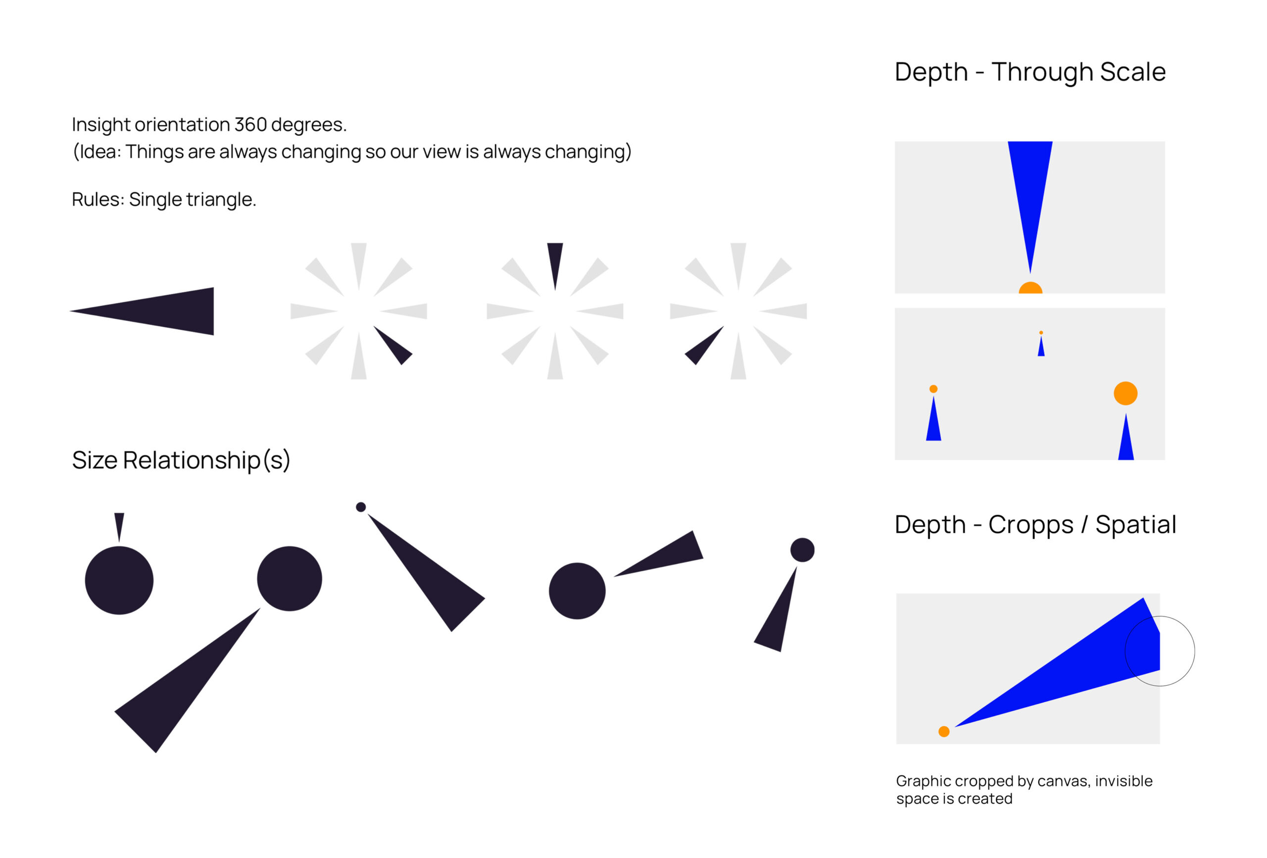
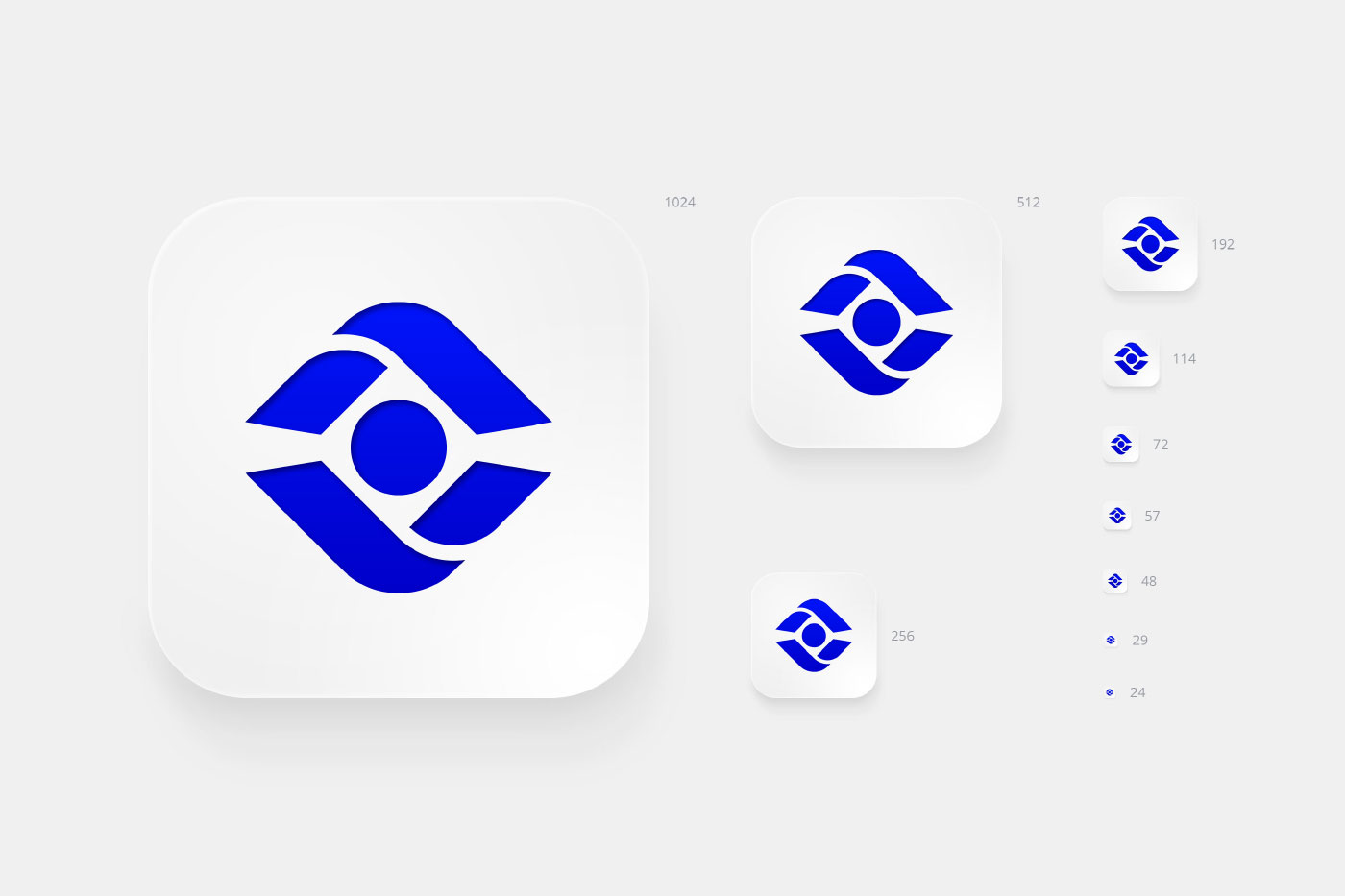
Once the final mark was chosen and approved I started to think of this as a scalable system and explored how to architect holistic rules. Size proportions, spacial relationships, orientation, and depth through scale.
Once the final mark was chosen and approved I started to think of this as a scalable system and explored how to architect holistic rules. Size proportions, spacial relationships, orientation, and depth through scale.
Building the colour logic and how it ties into the Worker Solutions story.
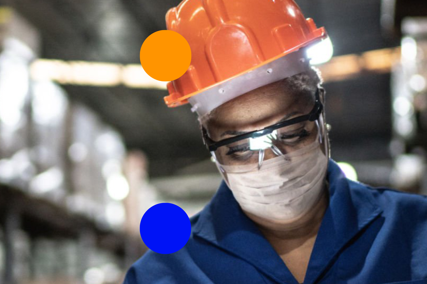
The primary colour story was lifted from the uniforms of workers who would benefit from using the WS platform.
Building the colour logic and how it ties into the Worker Solutions story.
The primary colour story was lifted from the uniforms of workers who would benefit from using the WS platform.
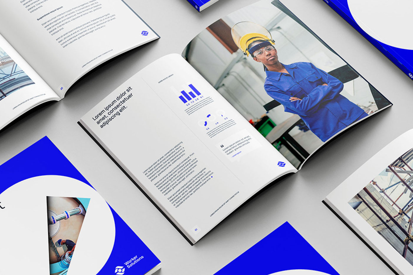
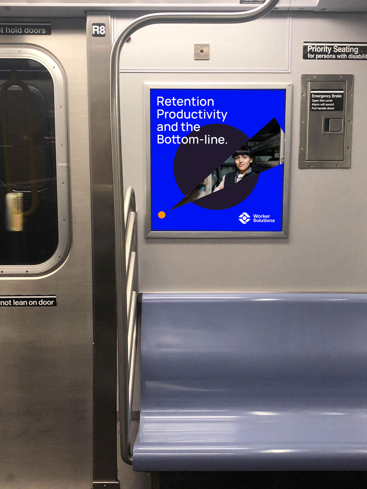
Showcasing how the brand extends to a variety of comms focused on the idea of “our insight reveals what workers need”. The content was divided into several categories that would be revealed using the spotlight graphic.
A succinct and consistent core message with an engaging visual brand wasn’t something the WS team had prior during their fundraising efforts. The new brand provided the team with a branded verbal and visual identity allowing them to deliver impactful presentations and establish a rhetoric towards a future partnership with YUM brands.
Given the brand is still new, its too early to set measurable benchmarks that will holistically drive where Worker Solutions will find success. However, the general consensus from the internal team was their surprise to the reception and how it engaged the LPs and other business leaders they spoke with.
With all projects you learn something new. What could I have done better? I’m sure a lot of things but specifically I would have liked to take more creative risks. It fuels ambition and enthusiasm to create something new and you spend less time and resources trying to motivate your team.
Moon Powered